Finding a beautiful warm white is only half the job. The real challenge begins when you start asking what should go around it.
What color should the trim be?
Should the kitchen cabinets match the walls or contrast with them?
Which green works with Shoji White?
Can you pair it with navy?
Does it look good with natural wood?
And perhaps most importantly, which colors will accidentally make Shoji White look too beige, yellow, or gray?
Sherwin-Williams Shoji White SW 7042 is one of those wonderfully versatile colors that can become the foundation of an entire home palette. Sherwin-Williams describes it as a muted white designed to create a warm, sophisticated, peaceful atmosphere, and its official color data places its Light Reflectance Value at approximately 74.
That means Shoji White is light enough to create an airy interior but has significantly more depth and warmth than a crisp, bright white.
Its softness is exactly what makes it attractive.
It works beautifully with natural wood, taupe, warm gray, muted green, brown, charcoal, black, navy, and many other earthy colors.
But Shoji White is not a completely neutral blank canvas.
Its warm beige-gray character means that some colors complement it far better than others.
In this complete guide, we’ll look at the best coordinating colors for Shoji White, including official Sherwin-Williams pairings, trim colors, accent colors, cabinetry options, exterior combinations, and complete palettes you can recreate throughout your home.
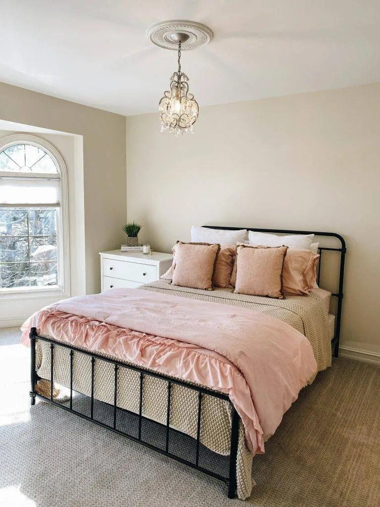
What Color Is Sherwin-Williams Shoji White SW 7042?
Shoji White is best described as a soft warm off-white with beige and subtle gray influences.
It isn’t a creamy yellow white.
It isn’t a cool gray-white.
And it definitely isn’t a brilliant gallery white.
Instead, Shoji White falls into that increasingly popular category of complex warm whites that can function almost like an extremely light greige.
Sherwin-Williams currently lists its color values as approximately:
- LRV: 74
- Hex: #E6DFD3
- RGB: 230, 223, 211
Its LRV is particularly important.
Pure bright whites often have LRVs well into the 80s or even around 90. Shoji White’s lower value gives it more body.
When you paint an entire room Shoji White, you can usually tell there is color on the walls.
It doesn’t disappear in the same way as an extremely clean white.
That characteristic helps Shoji White feel warm and inviting rather than stark.
What Are the Undertones of Shoji White?
Shoji White generally has warm beige, cream, and subtle gray undertones.
Depending on your lighting and surrounding materials, you may also notice a faint taupe quality.
This is what separates it from more obviously creamy whites.
A traditional cream may have strong yellow undertones.
Shoji White is more muted.
The gray influence softens the warmth, allowing it to work with contemporary interiors as well as traditional spaces.
However, lighting can change its appearance dramatically.
In warm southern light
Shoji White may appear warmer, creamier, and slightly more beige.
In north-facing rooms
Cooler natural light can bring forward its gray or muted characteristics.
In western afternoon light
Expect it to become particularly warm and cozy as golden sunlight enters the room.
Under warm artificial lighting
The cream and beige qualities may become stronger.
Under very cool LED lighting
Shoji White can appear more subdued and slightly grayer.
This is why you should always sample it before committing to an entire home.
Official Sherwin-Williams Coordinating Colors for Shoji White
Sherwin-Williams currently highlights three direct coordinating colors alongside Shoji White:
- Pure White SW 7005
- Fawn Brindle SW 7640
- Perle Noir SW 9154
These three colors actually demonstrate how versatile Shoji White can be.
Pure White gives you a light contrast.
Fawn Brindle provides a warm mid-tone neutral.
Perle Noir creates a dramatic dark contrast.
Together, they form an excellent starting palette.
Let’s look at each one.
1. Pure White SW 7005
Pure White SW 7005 is probably the most useful trim color to consider with Shoji White.
Despite its name, Pure White isn’t an aggressively cold or sterile white.
It is cleaner and brighter than Shoji White, which creates enough separation to define baseboards, crown molding, doors, cabinets, and other architectural details.
Sherwin-Williams specifically lists Pure White as a coordinating color for Shoji White.
Shoji White walls + Pure White trim
This is one of the easiest ways to use the combination.
The walls feel creamy and soft while the trim creates a fresher outline around the room.
Because the contrast isn’t extreme, the overall result remains subtle.
This combination is particularly good for:
- Living rooms
- Bedrooms
- Hallways
- Entryways
- Kitchens
- Dining rooms
- Open-plan interiors
Add natural oak, walnut, linen, beige upholstery, brass, or black accents and you have an extremely versatile neutral foundation.
Can Pure White be used on cabinets?
Yes.
Pure White kitchen cabinets against Shoji White walls can create a sophisticated two-white palette.
The difference is subtle enough to feel cohesive while providing more definition than painting everything exactly the same shade.
2. Fawn Brindle SW 7640
If you’re looking for a medium neutral that works naturally with Shoji White, Fawn Brindle SW 7640 is worth considering.
Sherwin-Williams lists Fawn Brindle as one of Shoji White’s direct coordinating colors.
Fawn Brindle brings noticeably more depth to the palette.
Think of it as an earthy, grounded taupe-gray rather than a conventional beige.
That’s exactly why it works.
Shoji White contains enough warm neutral influence to relate naturally to taupe, while its lighter value creates contrast.
Where to use Fawn Brindle
Consider it for:
- Kitchen islands
- Lower cabinets
- Bathroom vanities
- Accent walls
- Interior doors
- Built-ins
- Mudroom cabinetry
- Exterior shutters
Imagine Shoji White walls with Fawn Brindle cabinetry, creamy stone countertops, brushed brass hardware, and natural oak floors.
The palette feels warm and sophisticated without becoming overly beige.
This combination is especially attractive in transitional and organic-modern homes.
3. Perle Noir SW 9154
For dramatic contrast, Sherwin-Williams pairs Shoji White with Perle Noir SW 9154.
Dark colors can make warm whites look even more beautiful because the contrast emphasizes their softness.
Perle Noir provides a rich near-black element without requiring every surface to be bright.
Where to use Perle Noir with Shoji White
Try it on:
- Interior doors
- Built-in bookcases
- Kitchen islands
- Fireplace surrounds
- Bathroom vanities
- Accent walls
- Window frames
- Exterior shutters
- Front doors
A room with Shoji White walls, dark cabinetry, walnut furniture, cream textiles, and brass lighting can feel both timeless and contemporary.
The dark color grounds the room while Shoji White prevents the overall design from becoming heavy.
4. Urbane Bronze SW 7048
If you’re building an earthy Shoji White color palette, Urbane Bronze SW 7048 is one of the strongest accent-color directions to consider.
Urbane Bronze is a deep brown-gray neutral with an organic quality.
It gives you the drama of a dark color without looking quite as stark as black.
Why Urbane Bronze works with Shoji White
Both colors belong comfortably in warm, natural palettes.
Shoji White provides softness.
Urbane Bronze provides weight.
The contrast is strong, but their warm characteristics keep them connected.
Use Urbane Bronze for:
- Kitchen islands
- Accent cabinets
- Interior doors
- Exterior siding accents
- Fireplace walls
- Bedroom accent walls
- Bathroom vanities
Then bring in white oak, walnut, limestone, linen, and brass.
This is an especially effective palette for organic-modern interiors.
5. Rosemary SW 6187
Green is one of the easiest colors to pair with Shoji White because both feel natural and earthy.
For something deeper and more sophisticated, consider Rosemary SW 6187.
Interestingly, Sherwin-Williams has used Shoji White and Rosemary together in one of its curated Elegant Tradition palettes, alongside colors including Virtual Taupe and Iron Ore.
That gives us a particularly useful real-world color direction.
Shoji White + Rosemary
This combination feels warm, botanical, and grounded.
Use Shoji White for your main walls and Rosemary for:
- Cabinets
- Built-ins
- A kitchen island
- A home office
- An accent wall
- A mudroom
- Exterior shutters
Natural woods become the perfect bridge between them.
Oak makes the combination feel lighter and contemporary.
Walnut creates more richness.
Add brass hardware and the palette becomes especially elegant.
6. Iron Ore SW 7069
If true black feels too strong, Iron Ore SW 7069 provides another beautiful dark pairing.
Sherwin-Williams has included Shoji White and Iron Ore together in its curated palettes.
Iron Ore is an extremely deep charcoal.
That slight softness makes it less severe than a pure black.
Best ways to combine Iron Ore and Shoji White
One of the most effective approaches is:
Shoji White walls + Iron Ore doors.
This instantly adds architectural interest.
You could also use Iron Ore on:
- A fireplace
- Kitchen cabinets
- An island
- Built-in shelves
- Exterior trim
- Garage doors
- Shutters
The combination looks especially good with medium and light wood.
White oak floors, Shoji White walls, Iron Ore doors, and warm metal lighting create an easy contemporary palette.
7. Anew Gray SW 7030
For a softer neutral transition, consider Anew Gray SW 7030.
Sherwin-Williams has paired Anew Gray and Shoji White in its Elegant Tradition palette.
Anew Gray provides more depth than Shoji White without creating the dramatic contrast of charcoal or black.
That’s useful when you want a layered neutral interior.
Where Anew Gray works
Use Shoji White as the dominant color and Anew Gray on:
- An adjacent room
- Cabinetry
- A dining room
- Bedroom walls
- Built-ins
- Accent walls
This produces a whole-home palette that transitions naturally from light to medium neutrals.
It is particularly useful in open-plan homes where you want different spaces to feel distinct without introducing strong color.
8. Virtual Taupe SW 7039
If your dream palette involves creamy whites, brown, walnut, stone, and earthy fabrics, Virtual Taupe SW 7039 is another strong option.
Sherwin-Williams includes both Virtual Taupe and Shoji White in its Elegant Tradition collection.
Taupe naturally complements Shoji White because the two colors share warm neutral characteristics.
Shoji White is the airy version.
Virtual Taupe provides depth.
Try this palette
Use:
- Shoji White walls
- Pure White trim
- Virtual Taupe cabinetry
- Walnut furniture
- Cream textiles
- Brass or bronze fixtures
This is an excellent combination for traditional, transitional, or organic interiors.
9. Naval SW 6244
You aren’t limited to neutrals and greens.
Shoji White can also work beautifully with navy.
Sherwin-Williams includes Naval SW 6244 with Shoji White in its Elegant Tradition palette.
Navy provides a cooler counterpoint to Shoji White’s warmth.
That contrast makes both colors more interesting.
Shoji White + navy works well for
- Coastal homes
- Traditional interiors
- Dining rooms
- Offices
- Kitchen islands
- Bathrooms
- Exteriors
A navy island against Shoji White walls looks especially attractive with natural wood stools and brass hardware.
For a bedroom, try Shoji White walls with a Naval accent wall, cream bedding, warm wood furniture, and antique brass lamps.
The result is colorful without becoming trendy or overwhelming.
10. Homburg Gray SW 7622
For a deep green-gray direction, Homburg Gray SW 7622 is another sophisticated possibility.
Sherwin-Williams places Homburg Gray, Shoji White, and Iron Ore together within its Elegant Tradition collection.
Homburg Gray brings considerably more color than a conventional charcoal.
Its depth makes Shoji White appear brighter and creamier by comparison.
This is particularly beautiful in rooms where you want drama.
Try Homburg Gray for cabinetry, an office, a dining room, built-ins, or a fireplace wall while allowing Shoji White to remain the lighter connecting color through adjacent areas.
11. Cascades SW 7623
Want something even moodier?
Cascades SW 7623 offers an extremely rich green-blue direction.
Sherwin-Williams also includes Cascades within the broader palette containing Shoji White, Virtual Taupe, and other coordinating neutrals.
Cascades can look spectacular on:
- Library walls
- Kitchen cabinetry
- Built-ins
- A powder room
- An office
- A kitchen island
Shoji White prevents the dark color from overwhelming the overall palette.
Add warm walnut or oak and the room becomes rich and layered.
12. Antiquarian Brown SW 0045
Brown has made a major return to warm interior palettes, and it naturally belongs beside Shoji White.
Sherwin-Williams groups Antiquarian Brown SW 0045 with Shoji White, Anew Gray, and Blackberry within its Elegant Tradition color collection.
Brown works with Shoji White because both colors reinforce a warm, earthy atmosphere.
Use brown through paint or simply borrow the same idea through:
- Walnut
- Leather
- Dark oak
- Chocolate textiles
- Bronze finishes
You don’t necessarily need to paint an entire wall brown to benefit from the combination.
Best Green Colors With Shoji White
Green might be the easiest color family to combine with Shoji White.
Because Shoji White is warm and muted, look for equally sophisticated greens rather than bright grassy shades.
Good directions include:
- Sage green
- Olive green
- Rosemary
- Gray-green
- Deep forest green
- Muted eucalyptus
- Green-charcoal
Rosemary SW 6187 is particularly noteworthy because Sherwin-Williams itself has paired it with Shoji White.
For lighter interiors, use Shoji White walls and sage accents.
For more dramatic rooms, choose deeper olive or forest cabinetry.
Best Blue Colors With Shoji White
Blue provides contrast against Shoji White’s warm character.
The safest options tend to be muted or deep blues.
Think:
- Navy
- Slate blue
- Dusty blue
- Blue-gray
- Deep teal
- Muted denim
Naval SW 6244 is an especially strong option and appears with Shoji White within a Sherwin-Williams curated palette.
Avoid extremely icy pastel blue unless you have sampled it carefully.
Sometimes a very cool blue makes Shoji White appear unexpectedly yellow by comparison.
A deeper, muted blue generally creates a more sophisticated balance.
Best Taupe and Greige Colors With Shoji White
This is where Shoji White really shines.
Because it already contains warm neutral influences, it flows naturally into greige and taupe rooms.
Excellent directions include:
- Fawn Brindle
- Anew Gray
- Virtual Taupe
- Warm mushroom
- Balanced greige
- Medium taupe
- Soft warm gray
Sherwin-Williams includes several of these types of neutrals alongside Shoji White in its palettes, including Fawn Brindle, Anew Gray, and Virtual Taupe.
You can use these colors to create a layered whole-house palette without introducing obvious color.
Best Dark Colors With Shoji White
Shoji White becomes particularly beautiful when contrasted against a deep color.
Try:
- Perle Noir
- Iron Ore
- Urbane Bronze
- Charcoal
- Espresso brown
- Dark olive
- Deep navy
- Forest green
- Black
The trick is maintaining enough warmth elsewhere in the room.
If you combine Shoji White with dark charcoal, bring natural oak, walnut, brass, leather, or beige textiles into the space.
That prevents the palette from becoming overly stark.
What Trim Color Goes With Shoji White?
You have three main approaches.
Option 1: Pure White trim
This is perhaps the easiest.
Shoji White walls with Pure White SW 7005 trim create subtle but noticeable contrast, and Sherwin-Williams officially lists Pure White as a coordinating shade.
Use this when you want a traditional distinction between walls and trim.
Option 2: Shoji White trim
You can also paint the walls and trim Shoji White.
Instead of changing the color, change the sheen.
For example:
- Shoji White eggshell walls
- Shoji White satin or semi-gloss trim
This creates a soft, sophisticated monochromatic look.
It’s especially attractive in modern organic interiors.
Option 3: Dark trim
For something dramatic, use Iron Ore or another dark charcoal.
Shoji White walls with dark windows, doors, or trim create strong architectural contrast.
This works especially well in contemporary homes.
Should Kitchen Cabinets Be Shoji White?
Absolutely.
Shoji White can be a beautiful kitchen cabinet color when bright white feels too sterile.
Its warmth works especially well with:
- White oak floors
- Walnut islands
- Beige quartz
- Cream stone
- Marble
- Brass hardware
- Bronze hardware
- Black hardware
Because Shoji White has more pigment than very bright whites, cabinetry painted in it tends to feel soft and furniture-like.
Shoji White cabinets + Shoji White walls
This can work, especially if you’re creating a tonal kitchen.
Use different sheens and introduce contrast through the countertop, backsplash, hardware, or island.
Shoji White cabinets + warmer neutral walls
You can also pair Shoji White cabinets with light greige or taupe walls.
Just make sure the wall color has enough depth to distinguish itself.
Shoji White cabinets + dark island
This might be one of the best combinations.
Try a dark island in:
- Urbane Bronze
- Iron Ore
- Rosemary
- Naval
- Fawn Brindle
- Deep walnut stain
The contrast instantly makes the kitchen more interesting.
What Wood Tones Work With Shoji White?
One of Shoji White’s greatest strengths is how naturally it works with wood.
White oak
Excellent.
White oak and Shoji White create a soft organic-modern palette.
Medium oak
Also beautiful.
The warmth in Shoji White prevents medium oak from feeling isolated.
Walnut
Walnut provides wonderful dark contrast.
Use it for furniture, cabinetry, doors, or an island.
Dark stained wood
Shoji White is light enough to balance espresso and deep brown finishes.
Honey oak
This combination can work surprisingly well.
Because Shoji White is warmer than crisp white, the transition to golden oak isn’t as harsh.
However, sample the combination carefully if your oak has very strong orange undertones.
Does Shoji White Work With Black?
Yes.
Black and Shoji White create a classic high-contrast palette, but Shoji White softens the effect.
Bright white plus black can feel graphic and modern.
Shoji White plus black feels warmer.
Try black through:
- Lighting
- Door hardware
- Window frames
- Faucets
- Cabinet handles
- Furniture
- Picture frames
Or use a softer near-black such as Perle Noir or Iron Ore for larger painted surfaces.
Complete Shoji White Color Palette Ideas
If you’re struggling to visualize everything together, here are several ready-made palette directions.
Palette 1: Warm Organic
Walls: Shoji White
Trim: Pure White
Accent: Rosemary
Wood: White oak
Metal: Aged brass
Textiles: Cream, oatmeal, muted olive
This palette feels relaxed, natural, and modern.
Palette 2: Modern Contrast
Walls: Shoji White
Trim: Pure White
Doors: Iron Ore
Furniture: Walnut
Metal: Matte black
Textiles: Beige and cream
Ideal for a clean contemporary home without making everything cold.
Palette 3: Layered Neutral
Main walls: Shoji White
Secondary room: Anew Gray
Cabinetry: Fawn Brindle
Wood: Medium oak
Accent: Chocolate brown
Metal: Bronze
This is an excellent palette if you want very little obvious color.
Palette 4: Classic Navy
Walls: Shoji White
Trim: Pure White
Island or cabinetry: Naval
Wood: Walnut
Metal: Brass
Textiles: Cream, tan, muted blue
Timeless and particularly effective in kitchens and dining rooms.
Palette 5: Earthy Drama
Walls: Shoji White
Cabinetry: Urbane Bronze
Accent: Rosemary
Wood: Natural oak
Metal: Black or aged brass
Textiles: Camel, cream, olive
Perfect for organic-modern or transitional interiors.
Colors That May Be Difficult With Shoji White
Shoji White is versatile, but not every color is equally easy.
Extremely cool whites
A very blue, brilliant white can make Shoji White appear surprisingly beige or dingy.
That doesn’t automatically make the combination wrong, but the contrast may be greater than expected.
Icy gray
Cool blue-gray can exaggerate Shoji White’s warmth.
If you’re combining the two, sample them directly beside each other.
Bright yellow
Because Shoji White already contains warmth, strong yellow may create an overly creamy palette.
Muted ochre or mustard is often easier.
Pink-heavy beige
Some pink or violet taupes may interact strangely with Shoji White’s undertones.
Again, sampling is essential.
Is Shoji White a Good Whole-House Color?
Yes, and this may actually be one of its best uses.
Shoji White has enough warmth to make bedrooms and living spaces comfortable while remaining light enough for hallways and open-plan areas.
Instead of using a different neutral in every room, you can keep Shoji White as your connecting color and introduce deeper shades strategically.
For example:
Hallway: Shoji White
Living room: Shoji White
Dining room: Rosemary
Office: Naval or Homburg Gray
Kitchen: Shoji White + Fawn Brindle
Doors: Iron Ore
The result feels coordinated without being repetitive.
Sherwin-Williams’ own curated palettes demonstrate how Shoji White can sit beside warm gray, taupe, navy, green, brown, charcoal, and near-black colors.
Is Shoji White Good for Exteriors?
Shoji White can also be extremely attractive outside.
Exterior sunlight typically makes paint appear lighter than it does indoors, which can help Shoji White read as a soft warm white rather than a noticeable beige.
It can pair beautifully with:
- Black windows
- Iron Ore trim
- Dark bronze gutters
- Natural wood doors
- Stone
- Brick
- Charcoal roofing
- Warm brown accents
Sherwin-Williams lists Shoji White for both interior and exterior use in its current color data.
On a modern farmhouse, Shoji White can provide the light exterior look without the harsh brightness of a pure white.
On traditional architecture, its softness can feel more historically sympathetic.
Final Thoughts: What Colors Look Best With Shoji White?
The reason Sherwin-Williams Shoji White SW 7042 is so useful isn’t simply that it’s a pretty off-white.
It’s that it gives you somewhere to go.
You can make it light and airy with Pure White.
You can create a warm tonal scheme with Fawn Brindle, Anew Gray, or Virtual Taupe.
You can bring nature indoors with Rosemary.
You can add classic color with Naval.
You can create dramatic architectural contrast with Iron Ore or Perle Noir.
And you can build an earthy organic palette with Urbane Bronze, walnut, white oak, cream, linen, and brass.
Sherwin-Williams’ own recommendations and curated palettes support many of these directions, pairing Shoji White with colors ranging from Pure White and Fawn Brindle to Rosemary, Naval, Virtual Taupe, Anew Gray, Homburg Gray, Iron Ore, and other deep accent shades.
If you want the simplest complete Shoji White palette, start here:
Main walls: Shoji White SW 7042
Trim: Pure White SW 7005
Warm neutral: Fawn Brindle SW 7640
Green: Rosemary SW 6187
Blue: Naval SW 6244
Dark accent: Iron Ore SW 7069
Wood: White oak or walnut
Metal: Aged brass, bronze, or matte black
That combination gives you enough variation to decorate an entire house while keeping every room visually connected.
The only rule worth treating seriously is to sample before painting.
Sherwin-Williams itself warns that colors displayed on screens may not accurately represent actual paint and recommends checking physical color cards or samples before making a final decision.
Look at Shoji White beside your flooring, countertops, cabinets, furniture, and trim.
Check it in morning light.
Check it at sunset.
Turn on your lamps at night.
Then compare your coordinating colors beside it.
Shoji White is a complex neutral, and that complexity is exactly what makes it so appealing. When surrounded by the right colors and materials, it stops looking like “just another white” and becomes the warm, sophisticated foundation that ties an entire home together.