Wood trim and wood furniture can make a home feel warm, timeless, and full of character. But when it comes time to choose a wall color, that same beautiful wood can suddenly make the decision surprisingly complicated.
A paint color that looks perfect in a bright white showroom may appear dull beside honey oak. A cool gray that seemed sophisticated on Pinterest can turn strangely blue next to cherry wood. Even a simple beige may look too yellow when placed beside warm pine or golden-toned trim.
The good news is that wood does not limit your paint choices.
In fact, wood trim and furniture often look their best when the wall color is chosen specifically to complement the wood’s undertones rather than compete with them.
The secret is understanding whether your wood leans warm, cool, red, orange, yellow, brown, or neutral.
Once you recognize that, choosing paint becomes much easier.
This guide explores the best paint colors that go with wood trim and wood furniture, including warm whites, greige, beige, sage green, blue, taupe, cream, and deeper dramatic shades.
We’ll also look at which colors work best with oak, cherry, walnut, maple, mahogany, pine, and darker stained wood.
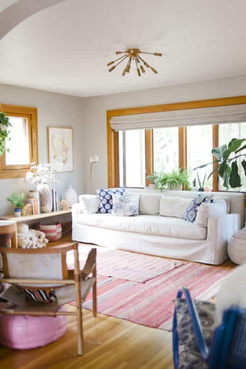
Why Wood Changes the Way Paint Colors Look
Wood is technically a neutral material, but it rarely behaves like a completely neutral color.
Every species and stain has an undertone.
For example:
- Honey oak often contains yellow and orange undertones.
- Cherry wood usually has strong red or reddish-brown tones.
- Walnut tends to be deep brown with subtle purple, gray, or chocolate influences.
- Pine often appears yellow or golden.
- Mahogany contains rich red-brown undertones.
- White oak is typically lighter and more muted.
- Maple can lean creamy yellow or pale golden brown.
When you place a paint color next to wood, your eye automatically compares the two.
That comparison can exaggerate undertones.
A slightly cool gray may suddenly look blue next to orange oak.
A warm cream beside yellow pine may appear much more yellow than expected.
A soft green beside reddish wood may become richer and more noticeable.
This doesn’t mean these combinations are wrong.
It simply means you need to evaluate paint and wood together.
1. Warm White
One of the safest and most timeless paint colors for wood trim and wood furniture is warm white.
Warm white creates contrast without looking harsh.
Unlike brilliant blue-based whites, warm whites contain subtle cream, beige, or gray undertones that help them blend naturally with wood.
This makes them especially beautiful in homes with traditional millwork.
Imagine a room with dark walnut furniture, medium oak trim, linen curtains, and warm white walls.
The wood becomes the star while the walls quietly brighten the space.
Why warm white works
Wood already brings visual warmth and texture into a room.
A warm white gives that wood breathing room.
Instead of competing with the grain and tone, the wall acts like a clean background.
Warm white is particularly useful when your home contains several different wood tones.
Maybe your trim is oak, your dining table is walnut, and your bookcase is a darker brown.
Trying to find a colored paint that matches all three can become difficult.
A warm white simplifies everything.
Best wood tones for warm white
Warm white pairs beautifully with:
- Honey oak
- White oak
- Walnut
- Cherry
- Mahogany
- Pine
- Maple
- Medium brown stains
- Dark espresso finishes
If you have strong orange-toned wood, choose a white that is warm but not excessively creamy.
If the white is too yellow, it can intensify the orange quality of the wood.
2. Soft Greige
Greige is one of the most versatile wall colors available for homes with natural wood.
A combination of gray and beige, greige offers the modern sophistication of gray without the coldness that sometimes clashes with wood.
The best greige for wood trim usually has enough warmth to connect naturally with the flooring, furniture, or cabinetry.
Why greige works with wood
Think of greige as a bridge.
Wood is warm.
Gray can be cool.
Beige is warm.
Greige sits between these worlds.
That’s why it works so well in transitional interiors where traditional wood details meet more modern furniture and finishes.
A soft greige wall beside oak trim can immediately make the wood look more intentional and contemporary.
Instead of feeling dated, the trim becomes a deliberate architectural feature.
Greige with honey oak
Honey oak often looks best with greiges that have beige, taupe, or subtle green undertones.
Avoid extremely cool blue-gray colors.
Those shades can make orange or yellow oak appear even stronger by contrast.
Greige with walnut
Walnut is more forgiving.
Its deeper brown tone looks beautiful with both warm greige and slightly cooler gray-greige shades.
Add creamy upholstery, brass accents, black lighting, and natural stone for a sophisticated neutral palette.
3. Cream
Cream and wood are a classic combination.
There is something naturally comfortable about creamy walls beside warm timber.
The result can feel traditional, farmhouse-inspired, Mediterranean, cottage-like, or quietly luxurious depending on the furniture and accessories.
When cream works best
Cream is particularly successful with darker wood.
Deep walnut, cherry, mahogany, and espresso furniture look dramatic against a soft cream background.
The contrast lightens the room without introducing another strong color.
Cream also works beautifully with pine and oak, but you need to pay attention to yellow undertones.
If both your wood and paint contain strong yellow, the entire room may feel more golden than expected.
For a more balanced look, choose a cream with slightly muted beige or neutral undertones.
Pair cream walls with
- Walnut furniture
- Traditional cherry pieces
- Antique mahogany
- Oak floors
- Leather seating
- Brass fixtures
- Linen curtains
- Persian or vintage-style rugs
This combination works especially well in dining rooms and living rooms.
4. Sage Green
Sage green may be one of the most beautiful paint colors to combine with natural wood.
It makes sense when you think about it.
Green and wood already exist together in nature.
Muted green walls naturally complement timber because the colors feel familiar and organic.
Why sage green works
Sage is not a bright emerald or grassy green.
It usually contains gray, beige, or olive undertones.
That muted quality allows it to behave almost like a neutral.
Beside wood, sage creates a calm, grounded atmosphere.
It is especially attractive in rooms with plenty of natural texture.
Think oak furniture, woven baskets, linen, ceramic pottery, leather, and botanical artwork.
Sage green with oak
Honey oak and sage can be a fantastic pairing.
The green helps balance the orange or yellow undertones in the wood.
Look for muted sages rather than blue-green colors.
An olive-gray sage often feels particularly harmonious.
Sage green with walnut
Walnut and sage create a deeper, more sophisticated look.
Add brass or black hardware, cream upholstery, and warm lighting.
This palette works beautifully in libraries, offices, bedrooms, and dining rooms.
5. Muted Blue
Blue and wood are another naturally successful combination.
The coolness of blue contrasts with the warmth of wood, creating visual balance.
However, not every blue works equally well.
For most interiors, muted blues are easier to live with than extremely bright shades.
Think dusty blue, slate blue, blue-gray, denim, or soft coastal blue.
Blue with warm wood
Warm woods such as oak, cherry, and pine naturally stand out against blue walls.
This can be useful if you want the wood to become an intentional design feature.
A muted blue-gray living room with oak trim can feel fresh and sophisticated rather than dated.
Blue with dark furniture
Dark walnut or mahogany furniture can look particularly elegant against blue.
Deep navy, slate, and smoky blue walls create a rich library-like atmosphere.
For a lighter room, use pale blue-gray instead.
Pair with cream textiles and brass or bronze accents.
Best rooms for blue and wood
This combination works especially well in:
- Bedrooms
- Home offices
- Dining rooms
- Libraries
- Living rooms
- Bathrooms with wood vanities
6. Soft Beige
Beige and wood may sound predictable, but the right beige can make a room feel incredibly warm and polished.
The key is avoiding beige shades that match the wood too closely.
You want harmony, not monotony.
Why beige works
Beige naturally shares many undertones with wood.
Both often contain brown, yellow, taupe, or golden characteristics.
Because of that connection, beige creates a very cohesive atmosphere.
This is useful in traditional homes, farmhouse interiors, rustic spaces, and warm contemporary rooms.
Choosing beige carefully
If your wood is very yellow, avoid extremely yellow beige.
If your wood is orange, look for beige with a slightly gray or taupe undertone.
If the wood is dark brown, you have more flexibility.
A soft sandy beige can create beautiful contrast with dark furniture.
Add contrast with
- Black accents
- Cream fabrics
- White ceilings
- Charcoal accessories
- Muted green
- Dark metal lighting
Without contrast, an all-beige-and-wood room can feel flat.
A few darker elements keep the design grounded.
7. Taupe
Taupe is an underrated companion for wood.
Sitting somewhere between brown and gray, taupe naturally relates to the brown tones in wood while still offering enough contrast to define the walls.
Taupe and walnut
This pairing is especially elegant.
Walnut already contains deep brown and often slightly cool undertones.
Taupe walls reinforce the richness without creating a heavy appearance.
Add warm white trim, cream upholstery, and brass lighting for a sophisticated room.
Taupe and oak
Taupe can also calm golden oak.
A beige-gray taupe reduces the visual intensity of orange and yellow without creating the stark contrast of cool gray.
This makes taupe an excellent choice if you want to modernize a home with lots of oak trim without painting the wood itself.
Best decorating styles
Taupe works well in:
- Transitional interiors
- Organic modern homes
- Traditional rooms
- Luxury neutral spaces
- Minimalist interiors with natural materials
8. Olive Green
If sage feels too light or delicate, olive green can provide more depth.
Olive contains yellow and brown influences, which allow it to connect naturally with wood.
This combination can feel earthy, vintage, sophisticated, or even slightly dramatic.
Olive with dark wood
Dark walnut or mahogany looks exceptional beside olive.
The combination recalls classic libraries, old European interiors, and rich traditional homes.
Use brass lamps, aged leather, textured curtains, and warm white ceilings to complete the look.
Olive with oak
Olive can also work with oak because both contain warm undertones.
Choose a muted olive rather than a bright yellow-green.
This keeps the room sophisticated.
Olive walls are particularly beautiful in dining rooms, offices, mudrooms, and bedrooms.
9. Charcoal Gray
Wood trim does not always require a light wall color.
Sometimes a darker backdrop makes wood look even better.
Charcoal gray is one of the most dramatic examples.
Why charcoal works
Dark gray creates strong contrast against medium and light wood.
White oak, maple, and natural pine can look incredibly striking against charcoal walls.
The grain becomes more visible and the room feels intentional and architectural.
Dark wood also works with charcoal, but the result becomes moodier.
Use plenty of texture and warm lighting to keep the room from feeling too dark.
Charcoal with wood furniture
Try charcoal walls behind:
- A walnut dining table
- Oak shelving
- Mid-century furniture
- Leather chairs
- A light wood bed frame
- Rustic wooden cabinets
Add warm white, beige, cream, or soft tan textiles to keep the palette balanced.
10. Soft Black
Black walls might sound intimidating, but soft black can create one of the most sophisticated backgrounds for wood furniture.
Instead of pure jet black, look for colors containing charcoal, brown, or warm gray undertones.
Soft black with warm wood
Warm wood glows against dark walls.
A walnut console or oak dining table immediately becomes a visual focal point.
This is especially effective in dining rooms, offices, powder rooms, and bedrooms.
How to make black walls feel inviting
Use warm lighting.
Add linen, wool, leather, brass, and cream-colored fabrics.
The contrast between black walls and warm natural materials creates a rich, layered appearance.
11. Dusty Blue-Green
For homeowners who want something slightly more colorful than sage, blue-green can be a beautiful choice.
Think muted teal, dusty eucalyptus, or smoky green-blue.
These shades combine cool blue with natural green, providing contrast with warm wood while retaining an organic feeling.
Best with
- Walnut
- Teak
- Oak
- Mid-century furniture
- Dark brown leather
Dusty blue-green works particularly well in mid-century and eclectic interiors.
Teak furniture against a muted teal wall is a classic combination.
Add mustard, cream, rust, or black for additional depth.
12. Mushroom
Mushroom paint colors have become popular because they combine beige, gray, brown, and taupe in a way that feels warm but contemporary.
They’re particularly effective with wood trim.
Why mushroom works
Unlike traditional beige, mushroom shades tend to be more muted.
They don’t exaggerate yellow wood tones as easily.
Instead, they connect with the brown characteristics of wood while introducing enough gray to modernize the room.
Mushroom with oak
This may be one of the easiest combinations for homeowners trying to update oak trim.
A mushroom wall can make the oak feel purposeful rather than outdated.
Pair with cream upholstery, black accents, muted green, and natural woven textures.
Best Paint Colors for Honey Oak Trim
Honey oak is one of the most challenging wood tones because of its strong yellow-orange undertone.
Many homes built in previous decades contain honey oak trim, doors, cabinets, and flooring.
Painting all of that wood is expensive and often unnecessary.
The right wall color can completely change how the oak looks.
The best options usually include:
- Warm white
- Soft greige
- Mushroom
- Sage green
- Muted blue
- Taupe
Avoid choosing a wall color based only on whether it “matches.”
Sometimes a contrasting undertone actually makes the wood look more balanced.
For example, muted green helps counteract orange tones.
Blue-gray creates contrast but should be sampled carefully.
Very cool gray may make honey oak look more orange.
Best Paint Colors for Dark Wood Furniture
Dark furniture can make a room feel sophisticated, but too many dark surfaces can also make the space visually heavy.
Wall color is one of the easiest ways to balance it.
For walnut, espresso, mahogany, or dark cherry furniture, consider:
- Warm white
- Cream
- Pale greige
- Soft beige
- Light taupe
- Muted sage
- Dusty blue
These lighter shades create separation between the furniture and walls.
However, dark walls can also work.
A deep green, blue, or charcoal paired with dark furniture creates a luxurious, enveloping look.
The important thing is intentional contrast.
If both wall and furniture are medium brown, they may visually blend together.
If one is clearly lighter or darker, the design gains definition.
Best Paint Colors for Cherry Wood
Cherry wood contains noticeable red undertones.
Because red and green sit opposite each other on the color wheel, muted greens can look particularly beautiful with cherry.
Consider:
- Sage green
- Olive green
- Warm greige
- Taupe
- Cream
- Warm white
- Soft blue-gray
Avoid extremely pink or red-based beige unless you specifically want to emphasize the warmth of the wood.
A neutral with subtle green-gray undertones can help calm cherry’s redness.
Best Paint Colors for Walnut
Walnut is one of the easiest woods to decorate around.
Its deep brown tone works beautifully with warm and cool colors.
Some of the best choices include:
- Cream
- Warm white
- Greige
- Sage
- Olive
- Navy
- Blue-gray
- Charcoal
- Mushroom
- Taupe
For a lighter organic-modern room, pair walnut with cream or greige.
For a dramatic interior, use navy, forest green, charcoal, or even soft black.
Walnut is rich enough to hold its own against strong wall colors.
Best Paint Colors for Pine
Pine often has strong yellow or golden characteristics.
A cool paint color can help balance that warmth, but extremely cold gray may create too much contrast.
Good choices include:
- Soft white
- Warm greige
- Sage green
- Muted blue
- Soft taupe
- Light mushroom
If you want a rustic or cabin-inspired appearance, cream and earthy green work beautifully.
For something more modern, use a pale neutral gray-green.
Best Paint Colors for White Oak
White oak is currently popular because of its relatively soft, natural appearance.
It usually contains less orange than traditional honey oak.
This makes it especially versatile.
White oak pairs beautifully with:
- Warm white
- Off-white
- Greige
- Mushroom
- Sage green
- Charcoal
- Soft black
- Dusty blue
- Taupe
Organic modern interiors often combine white oak with warm white or mushroom walls.
For more contrast, try deep green or charcoal.
Should You Paint Wood Trim White?
Not necessarily.
There has been a long period in interior design where white trim was treated as the default.
But natural wood trim can add warmth, architectural detail, and character.
If the wood is in good condition, painting it may not improve the room.
In many cases, changing the wall color is enough.
Wood trim becomes problematic mainly when the surrounding palette fights with it.
A poor wall color can make oak look orange or cherry look overly red.
A complementary color can make the same wood look rich and intentional.
Before painting trim, try sampling better wall colors.
You may discover that you actually love the wood once everything around it works.
How to Mix Different Wood Tones in One Room
Your wood furniture does not have to match your trim perfectly.
In fact, matching every piece can make a room feel overly coordinated.
Mixing woods creates depth.
The trick is finding some common element between them.
You might combine:
- Light oak trim
- Walnut furniture
- A medium brown floor
These tones can coexist if the wall color acts as a neutral backdrop.
Warm white, greige, mushroom, and taupe are especially useful in rooms with mixed wood.
Try to repeat each wood tone at least once if possible.
For example, if you have a walnut table, repeat walnut in a picture frame, side table, or decorative object.
This creates visual rhythm.
How Lighting Changes Wood and Paint
Lighting plays a huge role in how paint interacts with wood.
Morning light can make one wall look completely different from the same wall in the evening.
North-facing rooms usually receive cooler, softer light.
Warm woods may appear slightly less golden, while gray paint can become cooler.
South-facing rooms receive stronger, warmer light.
Beige, cream, and oak may all appear warmer.
Western light becomes particularly golden in the late afternoon.
Eastern rooms are brightest in the morning.
Artificial lighting matters too.
Warm LED bulbs emphasize brown, beige, red, and yellow undertones.
Cool bulbs emphasize gray, blue, and green.
Always evaluate paint samples under the lighting you actually use.
Should Wall Color Be Lighter or Darker Than Wood Trim?
Either can work.
A lighter wall color creates subtle contrast and usually makes the room feel brighter.
A darker wall color makes wood trim more visually prominent.
For example:
Oak trim with warm white walls feels light and classic.
Oak trim with deep green walls feels dramatic and architectural.
Walnut furniture against cream walls feels elegant.
Walnut furniture against charcoal walls feels moody and luxurious.
The choice depends on the atmosphere you want.
How to Sample Paint Around Wood
Don’t rely on a tiny paint chip.
Wood contains grain, variation, and reflective surfaces that influence how you see surrounding colors.
Paint a large sample board or a substantial section of wall.
Place it directly beside the wood trim.
Look at it beside the flooring and furniture too.
Check the color in:
- Morning light
- Afternoon light
- Evening light
- Artificial lighting
You may notice undertones you never saw at the paint store.
This step can save you from repainting an entire room.
Best Overall Paint Colors for Wood Trim and Furniture
If you want a simple starting point, these are the most reliable color families:
For a bright timeless look:
Choose warm white.
For a modern neutral look:
Choose soft greige.
For a cozy traditional look:
Choose cream.
For a natural organic look:
Choose sage green.
For a sophisticated colorful look:
Choose muted blue.
For an earthy neutral home:
Choose mushroom or taupe.
For a dramatic room:
Choose charcoal, deep green, or soft black.
Final Thoughts
Wood trim and wood furniture are not obstacles that need to be hidden.
They’re design assets.
Natural wood adds warmth, texture, depth, and character that painted surfaces often struggle to reproduce.
The challenge is simply finding wall colors that allow those qualities to shine.
Warm whites create timeless contrast.
Greige modernizes traditional wood.
Sage green brings out its organic character.
Muted blue balances warm undertones.
Taupe and mushroom create sophisticated neutral rooms.
And deeper colors such as charcoal, olive, navy, and soft black can turn ordinary wood furniture into a dramatic focal point.
Before choosing any paint, identify the undertone of your wood.
Is it orange?
Yellow?
Red?
Chocolate brown?
Gray-brown?
Once you understand that undertone, compare it directly with your paint samples.
Don’t worry about making every material in the room match perfectly.
The most interesting interiors usually contain contrast.
Warm wood can sit beside cool blue.
Dark walnut can stand against cream.
Honey oak can look surprisingly beautiful beside sage.
Light oak can become striking against charcoal.
The goal isn’t to hide the wood.
It’s to give it the right backdrop.
When the wall color and wood work together, the entire room begins to feel more balanced, intentional, and inviting.
And sometimes, the trim or furniture you thought looked old-fashioned turns out to be exactly what gives the room its character.