For years, gray dominated interior paint.
Then homeowners started wanting something warmer.
Not the heavy golden beige associated with older interiors. Not an icy gray that makes every room feel cold. Instead, people began looking for neutrals that could combine the softness of beige with enough gray to feel current.
That’s exactly where Sherwin-Williams Accessible Beige SW 7036 fits.
Accessible Beige is one of those colors that proves beige doesn’t have to look dated.
It is warm without being overwhelmingly yellow, neutral without feeling lifeless, and versatile enough to work with everything from oak floors and natural stone to black fixtures and contemporary furniture.
Sherwin-Williams itself describes Accessible Beige as a beige distinguished from many traditional beiges by its gray undertones, which help give spaces a warm, comfortable character. The company currently classifies it as a light neutral suitable for both interior and exterior applications.
But Accessible Beige isn’t a perfect paint color for every room.
Lighting can make it appear warmer or cooler.
Certain wood tones can bring out its earthy side.
Some bright whites can make it look darker than expected.
And in a dim room, it has significantly more presence than an off-white.
So before covering your entire house in Accessible Beige, it’s worth understanding exactly how the color behaves.
This complete review covers everything you need to know about Sherwin-Williams Accessible Beige SW 7036, including its undertones, LRV, coordinating colors, trim options, cabinets, wood tones, room orientation, exteriors, and how it compares with other popular neutrals.
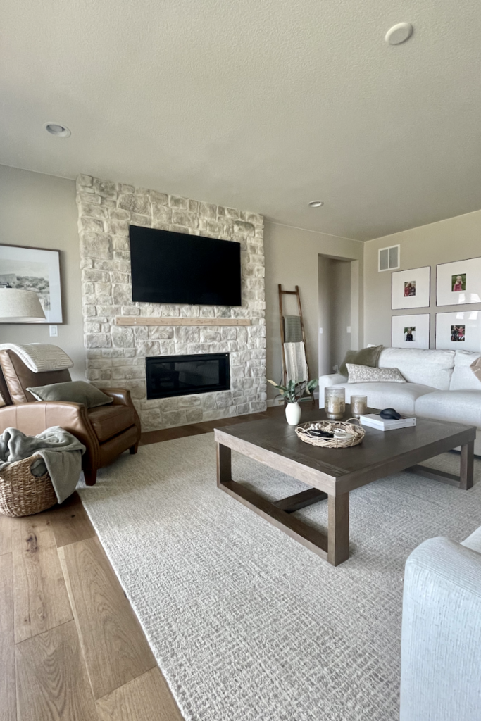
Accessible Beige SW 7036 at a Glance
| Detail | Accessible Beige SW 7036 |
|---|---|
| Brand | Sherwin-Williams |
| Color family | Neutral |
| LRV | 57.67 |
| Hex | #D1C7B8 |
| RGB | 209, 199, 184 |
| Overall character | Warm beige-gray |
| Undertones | Gray with warm earthy influence |
| Interior/exterior | Both |
| Best for | Living rooms, bedrooms, hallways, open plans, exteriors |
| Works well with | Wood, cream, white, taupe, muted blue, earth tones |
| Official coordinating colors | Aesthetic White, Sanderling, Cadet |
Sherwin-Williams’ current technical color information lists Accessible Beige at an LRV of 57.67, with RGB values of 209, 199, 184 and hex code #D1C7B8.
That LRV is one of the keys to understanding this color.
Accessible Beige isn’t nearly as pale as an off-white.
But it isn’t dark either.
It has enough depth to make white trim visible while still reflecting a reasonable amount of light.
What Color Is Accessible Beige?
Accessible Beige is best described as a warm beige softened by gray.
That’s important because many people hear “beige” and immediately imagine yellow walls.
Accessible Beige doesn’t behave like a strong golden beige.
Sherwin-Williams specifically notes that its gray undertones distinguish it from many other beige colors.
That gray influence tones down the warmth.
The result sits somewhere in the territory of:
beige + greige + taupe + warm gray
depending on the room.
In one house, Accessible Beige may appear clearly beige.
In another, it can look surprisingly greige.
In certain lighting and beside specific finishes, you may even notice a subtle earthy or slightly muted green quality.
That’s why photographs of Accessible Beige online can seem inconsistent.
The paint hasn’t changed.
The environment around it has.
Is Accessible Beige Actually Beige or Greige?
This is probably the most common question about the color.
The simplest answer is:
Accessible Beige is primarily beige, but it contains enough gray to function like a greige in many interiors.
Sherwin-Williams categorizes it as a neutral and directly describes its gray undertones.
Compared with a classic golden beige, Accessible Beige looks more muted.
Compared with a popular gray-heavy greige such as Agreeable Gray, however, Accessible Beige generally feels warmer and earthier.
Think of the neutral spectrum like this:
warm beige → Accessible Beige → greige → warm gray → cool gray
Accessible Beige sits closer to the warm side.
That’s exactly why it works so well in homes containing natural materials.
Accessible Beige Undertones
Understanding undertones is essential with any neutral paint.
Accessible Beige has a warm beige base with gray influence, but subtle secondary undertones can become visible depending on surrounding colors.
In some homes, you may notice an earthy taupe quality.
Against red or orange finishes, the color can appear calmer and more neutral.
Against very cool gray, blue, or brilliant white, it may suddenly look noticeably warmer.
This is normal.
Neutral paint colors are extremely sensitive to comparison.
Will Accessible Beige look yellow?
Usually not strongly.
It is far less golden than many traditional beige colors.
However, intense warm sunlight can increase its beige character.
Will Accessible Beige look gray?
Sometimes.
North-facing light or a room filled with warm wood may allow the gray influence to become more apparent.
But Accessible Beige generally doesn’t read as a conventional gray.
Can Accessible Beige look green?
Some homeowners notice a subtle earthy green influence under specific conditions.
That doesn’t mean you’re getting a sage wall.
It’s more accurate to think of Accessible Beige as having a muted organic quality that can occasionally shift slightly depending on flooring, lighting, and adjacent colors.
This is one reason it works so naturally with greenery, olive, sage, and wood.
What Is the LRV of Accessible Beige?
Accessible Beige has an official Light Reflectance Value of 57.67.
LRV runs on a scale from 0 to 100.
At the simplest level:
- Lower numbers reflect less light.
- Higher numbers reflect more light.
An LRV around 58 puts Accessible Beige comfortably in the light-to-mid neutral range.
It’s light enough for large wall areas but has considerably more pigment than colors in the 70s or 80s.
That means Accessible Beige will create visible contrast against white trim.
It won’t behave like an off-white.
Will Accessible Beige make a room dark?
Usually not if the room has reasonable natural or artificial light.
But in a very dark room, it can look considerably richer.
A paint color with an LRV near 58 won’t magically brighten a room that receives almost no light.
If your primary goal is maximum brightness, a lighter warm neutral or off-white may be better.
Accessible Beige in North-Facing Rooms
North-facing rooms generally receive cooler, softer daylight.
This can be good for Accessible Beige.
The cooler light often reduces some of its warmth, allowing the gray and muted qualities to become more visible.
Instead of looking golden, Accessible Beige may appear closer to a soft greige.
This can create a cozy but sophisticated atmosphere.
Accessible Beige works particularly well in a north-facing room when you have:
- Warm oak flooring
- Cream furniture
- Beige upholstery
- Natural wood
- Brass
- Brown furniture
- Warm stone
Those warmer elements help keep the room from feeling flat.
One caution
If the room is both north-facing and very dark, Accessible Beige may feel heavier than expected.
Always sample it before painting the entire space.
Accessible Beige in South-Facing Rooms
Southern exposure generally provides stronger, warmer natural light.
Accessible Beige will usually appear warmer here.
You may notice more of its beige character during the brightest parts of the day.
This can be beautiful in a living room with wood, cream upholstery, linen curtains, stone, and plants.
The result feels warm and organic.
But if you’re hoping Accessible Beige will look mostly gray, a sunny south-facing room probably isn’t where that will happen.
South-facing verdict:
Expect warmer, softer, more visibly beige Accessible Beige.
Accessible Beige in East-Facing Rooms
East-facing rooms receive warm sunlight in the morning and cooler light later.
Accessible Beige may look especially warm in the early part of the day.
By afternoon, it can become more muted.
This means the color may change noticeably throughout the day.
Bedrooms can benefit from this.
The warmer morning appearance feels inviting, while the quieter afternoon color maintains a relaxed atmosphere.
Accessible Beige in West-Facing Rooms
West-facing rooms typically experience the opposite pattern.
The color may look relatively neutral earlier in the day and become warmer as golden afternoon sunlight enters the room.
If you love warm, cozy interiors, Accessible Beige can be particularly beautiful in western light.
Add walnut furniture, linen, warm brass, and cream textiles and you’ll get a layered neutral room with plenty of depth.
Accessible Beige in Rooms With No Natural Light
Windowless hallways, bathrooms, and interior rooms depend almost entirely on artificial lighting.
That means your bulb temperature becomes extremely important.
Under warmer lighting
Accessible Beige will appear warmer and more traditionally beige.
Under neutral lighting
You’ll usually see a more balanced beige-gray.
Under very cool lighting
Its muted gray qualities may become stronger.
This is one of those situations where testing a sample under your actual fixtures is far more useful than studying photographs online.
Official Accessible Beige Coordinating Colors
Sherwin-Williams currently recommends three direct coordinating colors for Accessible Beige:
Aesthetic White SW 7035
Sanderling SW 7513
Cadet SW 9143
Together, these three colors give a useful picture of how Sherwin-Williams sees Accessible Beige functioning.
You have:
A light warm neutral.
An earthy middle neutral.
And a deeper muted blue.
That’s a remarkably usable palette.
Let’s look at each.
Accessible Beige + Aesthetic White SW 7035
Aesthetic White SW 7035 is the lightest official coordinating option.
This is a natural pairing because Aesthetic White provides a soft transition rather than an aggressive contrast.
Use Aesthetic White for:
- Adjacent rooms
- Light cabinetry
- Built-ins
- Softer trim applications
- Ceilings where you don’t want brilliant white
Accessible Beige and Aesthetic White create a layered warm-neutral palette.
Add oak or walnut and the combination becomes especially natural.
Sherwin-Williams places Aesthetic White directly beside Accessible Beige as a coordinating color.
Accessible Beige + Sanderling SW 7513
Sanderling SW 7513 adds more earthy depth.
Rather than introducing a dramatic color, it allows you to stay within a warm neutral family.
Consider Sanderling for:
- Cabinetry
- An accent wall
- A dining room
- Built-ins
- Interior doors
- A bathroom vanity
This is a great direction if you love layered beige, mushroom, taupe, and brown interiors.
Sherwin-Williams includes Sanderling among Accessible Beige’s official coordinating shades.
Accessible Beige + Cadet SW 9143
Want actual color?
Sherwin-Williams’ third official pairing is Cadet SW 9143.
The muted blue provides a cool counterpoint to Accessible Beige’s warmth.
This combination works because the colors balance rather than match.
Try Cadet on:
- Kitchen islands
- Bathroom vanities
- Office walls
- Built-ins
- Bedroom accent walls
- Exterior shutters
Then connect the palette through cream, wood, and natural textiles.
Best White Trim Colors With Accessible Beige
White trim gives Accessible Beige definition.
Because Accessible Beige has an LRV of about 58, there is enough difference between it and most whites to create clear architectural contrast.
Several white directions can work.
Pure White SW 7005
Pure White is one of Sherwin-Williams’ widely used whites and is a good starting point when you want clean but not excessively harsh trim.
Accessible Beige walls with cleaner white trim create a classic look.
Use it for:
Baseboards, crown molding, interior doors, windows, and cabinetry.
Alabaster SW 7008
Alabaster creates a softer contrast.
This pairing is useful in warm homes containing cream, natural wood, beige stone, and traditional finishes.
Aesthetic White SW 7035
For very soft contrast, Aesthetic White is worth considering—and Sherwin-Williams officially lists it as a coordinating color for Accessible Beige.
The result is subtle and tonal rather than crisp.
Should Accessible Beige Trim Be White?
Not necessarily.
You can also create a monochromatic room.
Try:
Accessible Beige walls + Accessible Beige trim
and simply change the sheen.
For example:
Walls in a washable matte or eggshell finish.
Trim and doors in satin or semi-gloss.
The change in sheen provides architectural definition while keeping the entire room wrapped in one color.
This approach can look particularly sophisticated in bedrooms and offices.
Accessible Beige With Wood Trim
This may be one of Accessible Beige’s greatest strengths.
If your home has natural wood trim and you don’t want to paint it white, Accessible Beige is absolutely worth sampling.
Because the color is warm and earthy, it tends to coexist more naturally with wood than many cool grays.
Accessible Beige + honey oak
This is a popular combination.
Honey oak contains strong yellow and orange undertones.
Very cool gray can make those undertones look even more intense.
Accessible Beige doesn’t create the same harsh temperature contrast.
Its warmth helps the wood and walls belong in the same overall palette.
Accessible Beige + white oak
Excellent.
White oak and Accessible Beige create a warm, organic-modern look.
Add cream, black, muted green, linen, and warm brass.
Accessible Beige + walnut
Also excellent.
Walnut gives the room dark contrast.
Accessible Beige keeps the background soft.
This combination works beautifully in living rooms, offices, and bedrooms.
Accessible Beige + cherry wood
Cherry can be trickier because of its red undertones.
Accessible Beige may work, but always sample the color beside the exact wood.
A muted green-gray sometimes balances red wood more effectively.
Accessible Beige With Oak Cabinets
If you have oak kitchen cabinets that you aren’t ready to replace or paint, Accessible Beige can be a smart wall-color candidate.
Its muted warmth generally works better with oak than an icy gray.
Pair the combination with:
- Warm white countertops
- Cream backsplash
- Muted green accessories
- Black hardware
- Bronze
- Soft white trim
The goal isn’t necessarily to match the oak.
It’s to stop fighting it.
Accessible Beige can help make traditional wood cabinetry feel much more intentional.
Can Accessible Beige Be Used on Kitchen Cabinets?
Yes.
Accessible Beige can make a beautiful warm-neutral cabinet color.
Instead of white cabinets, you get a soft beige-gray that feels more furniture-like.
It works particularly well with:
- White quartz
- Cream quartz
- Marble
- Warm stone
- White oak floors
- Walnut islands
- Brass hardware
- Black hardware
- Bronze hardware
Accessible Beige cabinets + white walls
This creates a subtle warm contrast.
Use a soft white rather than automatically choosing the brightest white available.
Accessible Beige cabinets + wood island
A walnut or natural oak island adds another layer of warmth.
Accessible Beige cabinets + dark island
Deep green, charcoal, muted blue, or brown can provide stronger contrast.
Accessible Beige in Living Rooms
Living rooms are one of the best applications for this color.
Why?
Because living rooms usually contain many materials at once.
You may have:
Wood flooring.
A cream sofa.
A brown leather chair.
Black lighting.
A stone fireplace.
Green plants.
Beige curtains.
Accessible Beige can connect all of those elements without becoming the dominant feature.
It’s especially effective if your decorating style is:
- Transitional
- Organic modern
- Modern farmhouse
- Traditional
- Rustic
- Warm contemporary
Sherwin-Williams currently showcases Accessible Beige in real residential interiors including kitchens and nurseries, demonstrating how adaptable the color is across different spaces.
Accessible Beige in Bedrooms
Bedrooms benefit from warmth.
Accessible Beige can make a bedroom feel cozy without becoming dark.
Try it with:
- Cream bedding
- White bedding
- Walnut furniture
- Oak furniture
- Sage accents
- Muted blue
- Camel
- Taupe
- Brass lighting
For a softer neutral bedroom, keep the entire palette tonal.
Accessible Beige walls, cream curtains, oatmeal bedding, and warm wood can create an extremely calming room.
For more contrast, introduce black or deep olive.
Accessible Beige in Bathrooms
Accessible Beige can work particularly well in bathrooms containing warm finishes.
Consider it if you have:
- Beige tile
- Travertine
- Cream stone
- Wood vanities
- Warm marble
- Brass hardware
It may be less successful beside very icy blue-gray tile.
Again, undertones matter.
In a small bathroom, remember that Accessible Beige has more depth than off-white.
Good lighting and white fixtures help maintain brightness.
Accessible Beige in Hallways
Hallways are another excellent application.
They often connect rooms containing different colors and materials, so a flexible neutral is useful.
Accessible Beige can transition between:
Green rooms.
Blue rooms.
Warm white rooms.
Wood-heavy spaces.
Taupe or brown rooms.
Sherwin-Williams classifies Accessible Beige among its light neutral colors and emphasizes light neutrals as adaptable foundations for interior spaces.
If your hallway is extremely dark, however, test a lighter neutral alongside it.
Is Accessible Beige a Good Whole-House Color?
Yes.
In fact, whole-house use is one of Accessible Beige’s strongest applications.
Its muted warmth allows it to connect with a wide variety of room colors.
You might use:
Main walls: Accessible Beige
Trim: Pure White
Kitchen: Accessible Beige + warm white cabinetry
Office: Cadet
Bedroom: Accessible Beige
Dining room: Deep olive
Doors: Dark charcoal
Wood: Oak and walnut
That gives you variety while keeping the overall home cohesive.
The key is making sure Accessible Beige works with your permanent finishes in every major connected area.
Accessible Beige and Black
Black is an excellent accent for Accessible Beige.
Why?
Because the warm neutral walls soften black’s severity.
Try black on:
- Interior doors
- Window frames
- Lighting
- Cabinet hardware
- Faucets
- Picture frames
- Furniture
The combination feels contemporary without becoming cold.
Add natural oak and you have one of the easiest modern-organic palettes to recreate.
Accessible Beige and Green
Green may be one of the best color families to pair with Accessible Beige.
Both feel earthy.
Try:
- Sage
- Olive
- Moss
- Eucalyptus
- Rosemary
- Deep forest green
Accessible Beige walls with olive cabinetry and oak flooring can look incredibly sophisticated.
Muted green also helps prevent a warm-neutral room from becoming a sea of beige.
Accessible Beige and Blue
Blue introduces temperature contrast.
Sherwin-Williams itself demonstrates this direction by listing Cadet SW 9143 as an official coordinating color.
Look for sophisticated blues such as:
- Muted navy
- Slate
- Dusty blue
- Denim
- Blue-gray
Be cautious with extremely icy blue if you don’t want Accessible Beige to appear much warmer by comparison.
Accessible Beige and Brown
Brown has returned strongly to warm interior palettes, and it fits naturally beside Accessible Beige.
You can introduce brown through:
- Walnut
- Leather
- Dark oak
- Chocolate textiles
- Bronze
- Brown paint
- Natural stone
This produces an earthy, layered palette.
The trick is varying the depth.
If every surface is medium beige-brown, the room can become flat.
Add cream and dark charcoal to create contrast.
Accessible Beige With Gray
Yes, beige and gray can coexist.
But choose the gray carefully.
Accessible Beige already contains gray influence, so warm gray and taupe generally transition naturally.
Very cold blue-gray may create more contrast than expected.
For an easy neutral palette, combine Accessible Beige with:
- Warm gray
- Mushroom
- Taupe
- Charcoal
- Greige
Avoid choosing a gray based solely on an online image.
Compare large samples directly.
Accessible Beige vs Agreeable Gray
These colors are often compared because both are popular Sherwin-Williams warm neutrals.
The broad difference is straightforward:
Accessible Beige is warmer and more beige.
Agreeable Gray is generally more gray/greige.
Choose Accessible Beige when your home contains lots of:
- Warm wood
- Beige stone
- Cream
- Brown
- Warm tile
- Earth tones
Choose a gray-heavier greige when your permanent finishes are cooler and more contemporary.
Neither is universally better.
They simply sit at different points on the neutral spectrum.
Accessible Beige vs Repose Gray
Accessible Beige is considerably warmer.
Repose Gray belongs much more clearly in the gray family.
If you’re trying to modernize a home with honey oak, beige tile, or brown granite, Accessible Beige may integrate more naturally.
If your home has cool gray flooring, white quartz, black finishes, and cooler stone, a gray such as Repose Gray may make more sense.
Accessible Beige vs Aesthetic White
These two are much easier to distinguish.
Aesthetic White is substantially lighter.
Sherwin-Williams officially lists Aesthetic White as one of Accessible Beige’s coordinating colors.
That means they can work beautifully together.
Use Accessible Beige for deeper walls and Aesthetic White where you want a lighter warm neutral.
It’s an excellent approach for an open-plan home where you want variation without changing undertone direction dramatically.
Accessible Beige vs Balanced Beige
Sherwin-Williams’ color strip places Balanced Beige SW 7037 immediately deeper than Accessible Beige SW 7036. The same strip continues into increasingly deeper neutrals including Tony Taupe and Virtual Taupe.
Balanced Beige therefore gives you a useful option when Accessible Beige feels too light.
Accessible Beige is easier for large wall areas.
Balanced Beige creates more richness and can be useful in dining rooms, offices, or rooms receiving strong natural light.
Is Accessible Beige Still Popular or Is It Dated?
Accessible Beige doesn’t depend on the old beige decorating formula.
It’s not the intensely yellow-beige associated with some previous decades.
Its gray influence gives it much more flexibility.
Sherwin-Williams continues to feature Accessible Beige as an active light neutral and labels it an Expert Pick on its current color page.
The broader shift toward warm interiors actually plays to its strengths.
Today’s popular palettes often combine:
- Natural wood
- Warm white
- Brown
- Olive
- Mushroom
- Stone
- Linen
- Brass
- Black
Accessible Beige fits into that world remarkably well.
So no, beige itself isn’t automatically dated.
It’s the specific beige—and what you pair with it—that matters.
Is Accessible Beige Too Dark?
For some rooms, yes.
Accessible Beige has an LRV of 57.67.
That means it has real depth.
If your room is tiny, windowless, and poorly lit, Accessible Beige may look heavier than the photographs you see in bright online interiors.
If you want almost-white walls, this isn’t the color.
Consider something lighter.
But in a bright living room or bedroom, the same depth can be exactly what makes Accessible Beige feel sophisticated rather than washed out.
Is Accessible Beige Too Warm?
Again, context matters.
If your entire home contains icy marble, cool gray floors, blue-white cabinets, and chrome, Accessible Beige may feel too warm.
If your home contains oak, walnut, cream, stone, beige, brown, or brass, the warmth can be an advantage.
Don’t evaluate warmth in isolation.
Evaluate it beside the materials that will remain in the room.
Accessible Beige for Exteriors
Accessible Beige is approved by Sherwin-Williams for both interior and exterior use.
Outside, colors typically appear lighter because they receive so much natural light.
Accessible Beige can therefore become a soft warm exterior neutral rather than an obviously dark beige.
It can pair beautifully with:
- Cream trim
- Warm white trim
- Black shutters
- Dark bronze
- Wood doors
- Stone
- Brown roofs
- Charcoal roofing
It is particularly useful when pure white would feel too stark against natural surroundings.
Best Exterior Accent Colors With Accessible Beige
For a traditional home:
Accessible Beige siding + warm white trim + dark brown door
For a modern home:
Accessible Beige siding + black windows + natural wood
For an earthy home:
Accessible Beige + deep olive + stone
For a coastal-inspired exterior:
Accessible Beige + muted blue + warm white
Because Sherwin-Williams directly pairs Accessible Beige with both earthy Sanderling and muted blue Cadet, those color families provide useful starting points for broader palettes as well.
Who Should Use Accessible Beige?
Accessible Beige is an especially good choice if:
Your home contains wood floors or trim.
You want something warmer than gray.
Traditional beige feels too yellow.
You like organic-modern or transitional interiors.
You need a neutral that works with earth tones.
You want noticeable contrast against white trim.
You have beige, cream, brown, or warm stone finishes that aren’t being replaced.
You prefer a cozy room over an ultra-bright white interior.
Who Should Avoid Accessible Beige?
You may want another color if:
Your home contains mostly very cool finishes.
You want a nearly white wall color.
Your room is extremely dark and you want maximum brightness.
You dislike seeing any beige on the walls.
Your counters and tile are blue-white and clash with warm neutrals.
You want a distinctly gray interior.
In those situations, a lighter off-white or gray-heavier greige may be more appropriate.
A Complete Accessible Beige Whole-House Palette
If you want an easy palette to build around Accessible Beige, try this:
Main wall color
Accessible Beige SW 7036
Light neutral
Aesthetic White SW 7035
Warm earthy neutral
Sanderling SW 7513
Muted blue
Cadet SW 9143
Trim
Soft or clean white
Dark accent
Charcoal or soft black
Green accent
Muted sage or olive
Wood
White oak, medium oak, or walnut
Metal
Aged brass, bronze, or matte black
Textiles
Cream, oatmeal, camel, muted green, brown
The first three coordinating colors come directly from Sherwin-Williams’ current Accessible Beige recommendations.
The remaining materials build naturally on the warm, earthy character of that official palette.
Final Verdict: Is Accessible Beige Worth Using?
Sherwin-Williams Accessible Beige SW 7036 is one of the stronger choices for anyone who wants a warm neutral without returning to heavy yellow beige.
Its defining characteristic is balance.
It gives you beige warmth.
Gray keeps that warmth muted.
An LRV of 57.67 gives it enough depth to create visible contrast while still keeping it in Sherwin-Williams’ light-neutral category.
And its versatility with natural materials is difficult to ignore.
Accessible Beige can work beautifully with:
Oak.
Walnut.
Cream.
Warm white.
Black.
Sage green.
Muted blue.
Brown.
Brass.
Stone.
That makes it especially useful in real homes where you’re not replacing every permanent finish just to accommodate a new wall color.
If you have honey-oak floors, the color can work with them.
If you’ve added newer black fixtures, it can work with those too.
If you’re mixing traditional furniture with contemporary pieces, Accessible Beige can provide a bridge between them.
Its official Sherwin-Williams coordinating palette—Aesthetic White SW 7035, Sanderling SW 7513, and Cadet SW 9143—also demonstrates how easily Accessible Beige moves between light neutrals, earthy colors, and muted cooler accents.
That doesn’t mean you should order ten gallons without testing it.
Accessible Beige can become noticeably warmer in strong southern or western sunlight.
It can look deeper in a dim north-facing room.
Very bright cool whites can make it seem more beige.
And cool tile or countertops may not cooperate with its warmth.
Sherwin-Williams itself warns that on-screen colors can differ from actual paint and recommends viewing a physical color sample before committing.
So test Accessible Beige on several walls.
Put the sample beside your flooring.
Compare it with the trim.
Hold it next to your kitchen cabinets.
Look at it in the morning.
Check again in the afternoon.
Then turn on your lamps at night.
If Accessible Beige remains attractive through those changes, you’ve probably found an excellent neutral for your home.
For homeowners choosing between gray that feels too cold and beige that feels too yellow, Accessible Beige occupies a particularly useful middle ground.
And that is exactly why SW 7036 continues to work so well: it doesn’t try to make your home look gray or beige.
It simply makes it feel warmer