Some paint colors are easy to describe.
White is white. Navy is navy. Beige is beige.
Then there are colors like Benjamin Moore Beach Glass 1564.
Look at Beach Glass in one room and you might call it blue. Move the sample beside warm wood and suddenly it seems greener. Put it in cool northern light and its gray undertone becomes much more obvious. Under warm evening lamps, the entire color can soften into an atmospheric blue-green neutral.
That complexity is exactly what makes Beach Glass so appealing.
Benjamin Moore officially describes Beach Glass 1564 as a calming blue whose gray undertone gives it greater versatility. The company lists its Light Reflectance Value at 49.7 and places it in the Benjamin Moore Classics collection.
An LRV around 50 also tells you something important right away:
Beach Glass is not a pale pastel.
It has enough depth to make a noticeable color statement on the walls.
At the same time, it is muted enough to work almost like a sophisticated neutral in the right interior.
This combination makes Beach Glass especially attractive for bedrooms, bathrooms, living rooms, dining rooms, home offices, cabinetry, and other spaces where you want color without creating an overly bright or saturated room.
But Beach Glass can be tricky.
If you’re expecting a simple soft blue, you may be surprised by its green or gray tendencies.
If you’re expecting a very light spa color, its depth may be greater than anticipated.
And if you’re choosing between Beach Glass and Benjamin Moore favorites such as Quiet Moments or Healing Aloe, those differences matter.
So let’s take a detailed look at Benjamin Moore Beach Glass 1564, including its undertones, lighting behavior, coordinating colors, trim choices, wood tones, room applications, and how it compares with similar paint colors.
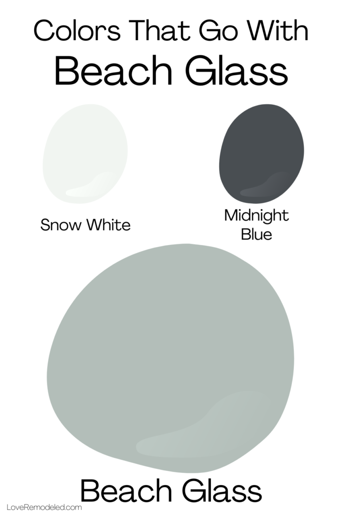
Benjamin Moore Beach Glass 1564 at a Glance
| Detail | Beach Glass 1564 |
|---|---|
| Brand | Benjamin Moore |
| Color number | 1564 |
| Collection | Benjamin Moore Classics |
| LRV | 49.7 |
| Overall color | Muted blue with gray influence |
| Secondary appearance | Blue-green-gray |
| Depth | Medium |
| Best rooms | Bedrooms, bathrooms, offices, dining rooms |
| Best style | Coastal, transitional, organic, traditional |
| Official coordinating whites | Snow White OC-66, Super White OC-152 |
| Official dark accent | Midnight Blue 1638 |
| Official warm accent | Man on the Moon OC-106 |
| Similar Benjamin Moore colors | Iced Marble, Imperial Gray, Wales Gray, Tranquility |
Benjamin Moore specifically describes Beach Glass as a calming blue softened by a gray undertone, so while many homeowners perceive green in the color, blue remains an important part of its official identity.
What Color Is Benjamin Moore Beach Glass?
Beach Glass is best described as a muted blue-gray with a noticeable blue-green character in many environments.
It isn’t turquoise.
It isn’t mint.
It isn’t a conventional blue-gray either.
Instead, it sits in the wonderfully complicated area between blue, green, and gray.
The gray undertone is what keeps Beach Glass from looking bright or tropical.
Imagine taking a soft coastal blue-green and mixing in enough gray to make it quieter and more sophisticated.
That’s Beach Glass.
Depending on your lighting, you may see:
- Muted blue
- Blue-gray
- Green-blue
- Soft teal-gray
- Smoky coastal green
- Gray-green with blue influence
This shifting personality is one of the main reasons online photos of Beach Glass can look so different.
In one room, it appears almost sage-like.
In another, it looks clearly blue.
Neither photograph is necessarily wrong.
Paint colors are constantly interacting with everything around them.
What Are the Undertones of Beach Glass?
The most important undertone in Beach Glass is gray.
Benjamin Moore explicitly describes gray as the undertone that gives this calming blue its versatility.
But in practical interiors, you’re also dealing with the relationship between blue and green.
This is why homeowners frequently describe Beach Glass as a blue-green-gray.
The balance can change according to:
- Natural light
- Room orientation
- Artificial lighting
- Flooring
- Wood tones
- Tile
- Cabinet colors
- Upholstery
- Nearby wall colors
Does Beach Glass look green?
It can.
Put Beach Glass beside a strong blue, and its green quality may become more noticeable.
Warm wood can also encourage the green side to emerge.
Does Beach Glass look blue?
Absolutely.
Benjamin Moore itself categorizes and describes Beach Glass around its calming blue character.
Cooler daylight often reinforces this.
Does Beach Glass look gray?
Yes, especially in lower light.
The gray prevents Beach Glass from becoming a bright coastal aqua.
That’s one reason it feels sophisticated enough for adult bedrooms, offices, dining rooms, and traditional interiors.
What Is the LRV of Beach Glass?
Benjamin Moore lists Beach Glass at an LRV of 49.7.
LRV stands for Light Reflectance Value.
The scale runs from 0 to 100.
At a basic level:
- Lower LRV = less light reflected
- Higher LRV = more light reflected
A color around 50 sits right in the middle.
That means Beach Glass has genuine visual weight.
It won’t behave like a pale off-white or barely-there pastel.
Against white trim, you’ll see strong definition.
In a well-lit room, Beach Glass can feel sophisticated and colorful without being dark.
In a poorly lit room, however, it can become considerably moodier.
This is one of the most important differences between Beach Glass and lighter colors such as Quiet Moments or Healing Aloe.
Is Beach Glass a Light or Dark Paint Color?
I would describe Beach Glass as a medium-depth paint color.
It isn’t dark in the way navy, charcoal, or deep forest green is dark.
But it is substantially deeper than many popular spa-like colors.
For comparison:
Healing Aloe 1562 has an LRV of 68.25.
Quiet Moments 1563 has an LRV of 60.73.
Beach Glass 1564 has an LRV of 49.7.
Mount Saint Anne 1565 has an LRV of 41.9.
Interestingly, these colors sit next to each other in Benjamin Moore’s progression:
Healing Aloe → Quiet Moments → Beach Glass → Mount Saint Anne.
As you move through them, the colors become noticeably deeper.
That makes Beach Glass a sweet spot for homeowners who find Quiet Moments too pale but Mount Saint Anne too dark.
Beach Glass in North-Facing Rooms
North-facing rooms receive cooler and generally softer natural light.
In this environment, Beach Glass can look:
- Cooler
- Grayer
- More blue
- Slightly deeper
The gray component may become especially noticeable.
If you want Beach Glass to look fresh and colorful, a dark north-facing room may not be its easiest environment.
But if you’re looking for a sophisticated, moody blue-green-gray, it can be beautiful.
Beach Glass works well in a north-facing room with:
- Warm white trim
- Medium oak
- Walnut
- Cream upholstery
- Brass
- Warm lamps
- Beige or warm stone
These warmer materials provide balance.
What to avoid
Be careful about combining Beach Glass with an entire room full of cool gray flooring, cool LEDs, silver-blue textiles, and blue-white trim.
That can push the palette too cold.
Beach Glass in South-Facing Rooms
South-facing rooms generally receive warmer, stronger daylight.
This can be a fantastic environment for Beach Glass.
The warmer sunlight softens the gray and may allow more of its green-blue complexity to show.
Instead of feeling chilly, the color often becomes richer and more relaxed.
In strong southern light, expect Beach Glass to feel:
- Softer
- Slightly greener
- More colorful
- Less gray
- More coastal or organic
This is where Beach Glass can really shine in living rooms and bedrooms.
Pair it with linen, oak, cream, warm white, woven materials, and brass and the color can feel effortlessly sophisticated.
Beach Glass in East-Facing Rooms
Eastern rooms get brighter, warmer morning light.
Beach Glass may look softer and slightly greener early in the day.
As the direct sunlight disappears, the color may become grayer and more blue.
This creates noticeable movement.
For bedrooms, that can be very attractive.
The morning color feels refreshing while the cooler evening version becomes more restful.
Beach Glass in West-Facing Rooms
Western rooms experience warmer sunlight later in the day.
Beach Glass may look calmer or grayer in the morning and considerably richer during the late afternoon.
Golden sunlight can enhance its warmer blue-green character.
This is particularly beautiful in dining rooms or living rooms where you spend more time later in the day.
Beach Glass in Windowless Rooms
This is where things become more complicated.
Because Beach Glass has an LRV under 50, a windowless room may make it look considerably darker.
That isn’t necessarily bad.
A small powder room painted Beach Glass could feel intimate and luxurious.
But if your goal is a bright spa bathroom, you may prefer something lighter.
Artificial lighting will control the appearance.
Warm lighting
Can soften the color and pull forward some green.
Cool lighting
Can make Beach Glass feel bluer and grayer.
Neutral white lighting
Usually provides the best sense of the balanced color.
Always test Beach Glass under the exact bulbs you’re planning to use.
Official Benjamin Moore Coordinating Colors for Beach Glass
Benjamin Moore currently provides two expert-picked color combinations for Beach Glass.
The first combines:
Beach Glass 1564
Snow White OC-66
Midnight Blue 1638
The second combines:
Beach Glass 1564
Super White OC-152
Man on the Moon OC-106
These official combinations show how flexible Beach Glass can be.
It works with:
- Soft white
- Cleaner white
- Deep navy
- Warm cream or beige
That gives you plenty of directions for building an entire room palette.
Beach Glass + Snow White OC-66
Snow White is one of Benjamin Moore’s official coordinating whites for Beach Glass.
This kind of combination is perfect when you want a softer overall look.
Use Beach Glass on the walls and Snow White on:
- Baseboards
- Crown molding
- Doors
- Windows
- Cabinets
The white allows Beach Glass to remain the focus without creating an excessively sharp contrast.
This is especially attractive in traditional or coastal interiors.
Beach Glass + Super White OC-152
Benjamin Moore also officially pairs Beach Glass with Super White OC-152.
This gives you a cleaner, brighter contrast.
The difference can make Beach Glass look deeper and more colorful.
Try this combination in:
- Bathrooms
- Kitchens
- Modern bedrooms
- Coastal spaces
- Transitional living rooms
Crisper white trim can create a fresher look, particularly when the room also contains white porcelain or marble.
However, remember that a very clean white can emphasize the gray-green complexity of Beach Glass.
That’s not a flaw—just an effect to expect.
Beach Glass + Midnight Blue 1638
For drama, Benjamin Moore recommends Midnight Blue 1638.
This makes a lot of sense.
Beach Glass already contains blue, so a deep navy creates a layered monochromatic relationship.
Try Midnight Blue on:
- A vanity
- Kitchen island
- Built-ins
- Interior doors
- An accent wall
- Furniture
Then use warm white to keep the palette from becoming too dark.
A bathroom with Beach Glass walls, Midnight Blue vanity, white marble, and brass hardware could be absolutely beautiful.
Beach Glass + Man on the Moon OC-106
Benjamin Moore also pairs Beach Glass with Man on the Moon OC-106.
This warmer direction is useful because it proves Beach Glass doesn’t have to live exclusively with cool whites and blues.
Warm cream and beige can balance it.
This creates a more organic and relaxed palette.
Try:
Beach Glass walls
Warm cream upholstery
Medium oak
Brass
Natural linen
The result feels sophisticated rather than overtly coastal.
Best White Trim Colors With Beach Glass
White trim is one of the easiest ways to use Beach Glass.
Benjamin Moore gives you two official starting points:
Snow White OC-66
and
Super White OC-152.
But the right white depends on the atmosphere you want.
For crisp contrast
Choose a cleaner white.
This makes Beach Glass appear darker and more saturated.
Ideal for bathrooms, kitchens, and more contemporary spaces.
For softer contrast
Choose a slightly warmer or more muted white.
This works beautifully with wood and warm furnishings.
Could you use White Dove?
Potentially, yes.
White Dove is a popular softer white and can make sense in a warmer Beach Glass palette, particularly if your home already uses it.
But don’t assume every white works.
Put the actual samples beside each other.
Beach Glass With Wood Trim
Beach Glass can be excellent with natural wood.
In fact, wood is one of the best ways to prevent this blue-gray color from becoming too cool.
Beach Glass + white oak
Beautiful.
White oak gives the color a modern, organic feeling.
Use cream fabrics and black or brass accents.
Beach Glass + medium oak
Also very good.
The warmth of the oak contrasts with Beach Glass without fighting it.
This can be particularly useful in homes where homeowners want to keep existing wood trim.
Beach Glass + walnut
Excellent.
Dark walnut gives Beach Glass a sophisticated, luxurious quality.
This combination works especially well in:
- Offices
- Bedrooms
- Libraries
- Dining rooms
Beach Glass + honey oak
Potentially very attractive.
The blue-green family sits opposite orange tones conceptually, so Beach Glass can help balance the warmth of honey oak.
However, because the contrast is stronger, you should definitely sample it beside your exact wood.
Sometimes the green component becomes more visible.
Beach Glass With White Cabinets
White cabinetry and Beach Glass are a classic combination.
The white keeps the room bright while Beach Glass provides definition.
This can work especially well in bathrooms and kitchens.
Try:
- Beach Glass walls
- White cabinets
- Marble or white quartz
- Nickel or brass hardware
- Natural wood accessories
The room gets color without becoming overwhelming.
Can You Paint Cabinets Beach Glass?
Yes—and it can be stunning.
Beach Glass cabinets work best when you want a muted blue-green statement rather than a conventional white or gray kitchen.
Consider Beach Glass for:
- Kitchen islands
- Lower cabinetry
- Bathroom vanities
- Mudroom cabinets
- Laundry cabinets
- Built-in bookcases
Because the LRV is 49.7, the color has enough depth to hold its own on cabinetry.
It is significantly more substantial than many pale blue-green cabinet colors.
Beach Glass cabinets + white walls
Probably the easiest combination.
Use warm or neutral white walls and allow the cabinetry to become the focal point.
Beach Glass cabinets + wood
Fantastic.
White oak shelves or walnut furniture can make Beach Glass feel much more sophisticated.
Hardware
Beach Glass can work with:
- Brass
- Bronze
- Black
- Polished nickel
- Brushed nickel
Brass makes it warmer.
Nickel emphasizes the cooler side.
Black creates more contrast.
Beach Glass in Bathrooms
Bathrooms are one of the most natural applications for Beach Glass.
The name alone suggests water, glass, and coastal landscapes, but the color doesn’t have to become a themed “beach bathroom.”
The gray undertone keeps it mature.
Beach Glass works beautifully with:
- White subway tile
- Marble
- White quartz
- White porcelain
- Light oak vanities
- Walnut vanities
- Brass fixtures
- Polished nickel
- Chrome
Is Beach Glass too dark for a small bathroom?
Not necessarily.
But remember that its LRV is 49.7.
That’s considerably deeper than many spa colors.
If the bathroom is windowless and poorly lit, Beach Glass may become moody.
If that’s what you want, great.
If you want something airy, look at Quiet Moments or Healing Aloe instead.
Beach Glass in Bedrooms
Bedrooms may be one of Beach Glass’s best applications.
Its blue-gray character naturally feels calm, while the green influence prevents it from becoming icy.
Use it with:
- White bedding
- Cream linen
- Oak nightstands
- Walnut furniture
- Brass lamps
- Beige rugs
- Woven textures
You don’t need much additional color.
Beach Glass already provides the visual interest.
For a lighter bedroom
Use plenty of white and pale wood.
For a moodier bedroom
Add navy, walnut, charcoal, and deeper textiles.
Both approaches work.
Beach Glass in Living Rooms
Beach Glass can work very well in living rooms, particularly where there is good natural light.
Because the color has more depth than many pale blue-greens, larger rooms can actually benefit from it.
A very light paint sometimes gets washed out in a bright living room.
Beach Glass retains enough body to remain visible.
Pair it with:
- Cream sofa
- Natural oak
- Walnut
- Linen
- Warm white
- Navy
- Camel leather
- Brass
- Black
That moves the color away from purely coastal styling and into transitional or organic-modern territory.
Beach Glass in Dining Rooms
This is an underrated application.
Dining rooms can handle more color than open-plan living spaces.
Beach Glass provides atmosphere without becoming intensely dark.
Try it with:
- Dark walnut dining table
- Linen chairs
- Brass chandelier
- Warm white trim
- Cream curtains
The combination can feel elegant and slightly traditional.
For more drama, introduce Midnight Blue, one of Benjamin Moore’s official coordinating colors.
Beach Glass in Home Offices
Beach Glass is also excellent for home offices.
Blue and green are naturally comfortable colors for spaces where you spend long periods.
The gray undertone keeps Beach Glass from becoming distracting.
Pair it with:
- Walnut desk
- Brass lighting
- Cream rug
- White built-ins
- Black frames
For a darker office, use navy cabinetry.
For a lighter one, keep furniture and trim white.
Beach Glass for Exteriors
Beach Glass can also be considered for exterior applications when used in an appropriate Benjamin Moore exterior paint product.
Outside, direct daylight will generally make paint appear lighter and somewhat less muted than it appears indoors.
Beach Glass could work nicely for:
- Exterior siding
- Shutters
- Front doors
- Porch ceilings
- Accent areas
It may be especially attractive with:
- Warm white trim
- Stone
- Gray roofing
- Natural cedar
- Dark navy accents
Because exterior light is dramatically stronger, always test a large exterior sample before committing.
A color that looks medium-depth inside may appear much lighter outdoors.
Beach Glass vs Quiet Moments
This is probably the comparison most readers need.
Both colors sit next to each other in Benjamin Moore’s color sequence.
Quiet Moments 1563 has an LRV of 60.73 and Benjamin Moore describes it as a gentle combination of blue and gray.
Beach Glass 1564 has an LRV of 49.7 and is described as a calming blue with gray undertone.
The biggest difference?
Quiet Moments is noticeably lighter.
Beach Glass has more depth and drama.
Choose Quiet Moments if you want:
- An airy bathroom
- A very soft bedroom
- More light reflection
- A subtle blue-gray
Choose Beach Glass if you want:
- More visible color
- A richer bedroom
- A deeper bathroom color
- Stronger contrast with white trim
If Quiet Moments seems washed out in your room, Beach Glass may be exactly what you’re looking for.
Beach Glass vs Healing Aloe
Healing Aloe 1562 is another nearby Benjamin Moore color.
Benjamin Moore describes Healing Aloe as a refreshing green with gray notes and gives it an LRV of 68.25.
That makes Healing Aloe much lighter than Beach Glass.
Healing Aloe feels:
- Lighter
- Greener
- Airier
- More delicate
Beach Glass feels:
- Deeper
- Bluer
- Grayer
- More substantial
For a bright spa bathroom, Healing Aloe may be easier.
For a bedroom, office, or dining room where you want more depth, Beach Glass can be stronger.
Beach Glass vs Mount Saint Anne
If Beach Glass isn’t deep enough, Benjamin Moore offers Mount Saint Anne 1565 immediately after it in the same color progression.
Mount Saint Anne has an LRV of 41.9 and Benjamin Moore describes it as a refined, versatile blue-gray.
Compared with Beach Glass:
Mount Saint Anne is deeper.
It generally feels more obviously blue-gray.
Beach Glass often reveals a little more green complexity.
Choose Beach Glass if:
You want something medium-depth.
Choose Mount Saint Anne if:
You want a richer, moodier wall color.
These two can look fairly similar on small chips, but the LRV difference becomes more obvious across an entire room.
Colors Similar to Beach Glass
Benjamin Moore currently lists several similar colors directly on the Beach Glass page:
- Iced Marble 1578
- Imperial Gray 1571
- Wales Gray 1585
- Tranquility AF-490
If Beach Glass seems close but not quite right, those are useful comparison samples.
Benjamin Moore also places Beach Glass between Quiet Moments and Mount Saint Anne in its neighboring color progression, giving you an easy way to move either lighter or darker without completely abandoning the general color family.
Does Beach Glass Work With Gray?
Yes, but choose the gray carefully.
Beach Glass already contains gray.
A warm charcoal can make it feel colorful.
A cool blue-gray may make the entire palette significantly cooler.
Try gray through:
- Stone
- Upholstery
- Rugs
- Tile
- Charcoal accents
Rather than using another medium blue-gray directly beside Beach Glass, create clearer contrast.
Either go much lighter or much darker.
Does Beach Glass Work With Beige?
Very well.
In fact, beige and tan can be excellent balancing colors.
Try Beach Glass with:
- Cream
- Oatmeal
- Camel
- Sand
- Mushroom
- Warm taupe
The warm neutral prevents the blue-green walls from feeling cold.
Benjamin Moore’s official pairing with Man on the Moon OC-106 points toward this warmer type of combination as well.
Does Beach Glass Work With Black?
Yes.
Black gives Beach Glass a more modern edge.
Use it sparingly through:
- Mirrors
- Lighting
- Cabinet hardware
- Window frames
- Furniture
- Picture frames
Add natural wood to keep the room from becoming too cool.
Beach Glass + white + black + oak is an easy contemporary palette.
Does Beach Glass Work With Brass?
Beautifully.
Warm metals such as brass and aged gold contrast with Beach Glass’s cooler character.
This is especially attractive in:
- Bathrooms
- Bedrooms
- Dining rooms
- Offices
A brass mirror against Beach Glass can instantly make the wall color feel richer.
If you prefer a cooler atmosphere, polished nickel is another natural partner.
Is Beach Glass a Coastal Paint Color?
Yes—but it doesn’t have to look coastal.
Its blue-green-gray character obviously lends itself to coastal interiors.
Pair it with:
- White
- Pale oak
- Linen
- Natural woven materials
and you get an easy coastal look.
But replace those materials with:
- Walnut
- Dark navy
- Brass
- Traditional furniture
and Beach Glass suddenly feels much more classic.
That’s the advantage of the gray undertone.
It prevents the color from being locked into one style.
Is Beach Glass Too Dark for a Whole House?
For most homes, I wouldn’t automatically choose Beach Glass as the single wall color throughout every room.
Its LRV of 49.7 gives it enough depth that carrying it through hallways, dark bedrooms, bathrooms, and poorly lit connecting spaces could become heavy.
It is usually better as a strategic color.
For example:
Main neutral: warm white
Primary bedroom: Beach Glass
Bathroom: Quiet Moments
Office: Beach Glass
Dining room: Beach Glass
Hallways: soft white or warm greige
This gives Beach Glass room to shine without overwhelming the home.
Who Should Choose Beach Glass?
Beach Glass is a strong choice if:
You want a blue-green color that feels sophisticated rather than bright.
Quiet Moments looks too light in your room.
You like colors that change with the light.
Your home contains natural wood.
You love spa-inspired bathrooms but want more depth.
You want a bedroom color that feels calming without being pale.
You like transitional, organic, coastal, or traditional decorating.
You have white trim and want noticeable contrast.
Who Should Avoid Beach Glass?
You may want another color if:
You need your room to feel extremely bright.
You dislike colors that shift between blue, green, and gray.
Your space has very little light and you don’t want a moody result.
You want a clearly defined blue.
You want an obvious sage green.
You prefer barely-there wall colors.
If your goal is a much lighter version of this general feeling, start with Quiet Moments or Healing Aloe instead. Their LRVs of 60.73 and 68.25 respectively make them substantially more reflective than Beach Glass.
A Complete Beach Glass Color Palette
If you want an easy starting palette, try this:
Main color
Beach Glass 1564
Soft white
Snow White OC-66
Crisp white
Super White OC-152
Deep blue
Midnight Blue 1638
Warm neutral
Man on the Moon OC-106
Wood
White oak or walnut
Metals
Aged brass, polished nickel, or matte black
Textiles
Cream, oatmeal, beige, navy, muted blue
The first four coordinating colors come directly from Benjamin Moore’s current expert-picked Beach Glass combinations.
From there, wood and neutral textiles help balance the blue-gray walls.
Final Verdict: Is Benjamin Moore Beach Glass a Good Paint Color?
Yes—Beach Glass 1564 is an excellent color if you want a sophisticated blue-green-gray with enough depth to make a real impact.
Its greatest strength is complexity.
Beach Glass isn’t simply blue.
It isn’t simply green.
And it isn’t simply gray.
Benjamin Moore officially describes it as a calming blue made more versatile by its gray undertone, and its LRV of 49.7 gives it noticeably more substance than many popular spa colors.
That makes Beach Glass particularly good for rooms where extremely pale colors can feel washed out.
A sunny bedroom can handle it.
A bathroom with lots of white tile can benefit from the contrast.
A dining room becomes richer.
A home office feels calm without becoming boring.
And natural wood makes the color especially beautiful.
Its official coordinating colors also reveal how adaptable it is.
Benjamin Moore pairs Beach Glass with Snow White OC-66 and Midnight Blue 1638 for a crisp blue-and-white direction, while another recommended combination uses Super White OC-152 and Man on the Moon OC-106, introducing a warmer neutral element.
If Beach Glass feels too dark, move one step lighter to Quiet Moments 1563, which has an LRV of 60.73.
If you want something even lighter and greener, Healing Aloe 1562 has an LRV of 68.25.
And if Beach Glass isn’t dramatic enough, Mount Saint Anne 1565 takes the same general color family deeper, with an LRV of 41.9.
That makes Beach Glass a particularly useful middle ground.
It has more personality than the palest blue-grays but doesn’t cross into truly dark territory.
Just don’t choose it from a computer screen.
Benjamin Moore specifically warns that on-screen colors can differ from actual paint, and the company recommends testing physical samples. Its liquid color sample is intended specifically for viewing the color over a larger area and observing how it changes under different lighting conditions.
Paint a generous sample.
Put it beside your flooring.
Compare it with your trim.
Look at it next to the vanity or cabinets.
Check it first thing in the morning.
Look again in the afternoon.
Then turn on your lights at night.
You may see three slightly different versions of Beach Glass during the same day.
And that’s really the point.
If you want a perfectly predictable blue, Beach Glass probably isn’t the color.
But if you want a nuanced, calming paint that moves gracefully between blue, green, and gray, Benjamin Moore Beach Glass 1564 can create an exceptionally beautiful room.