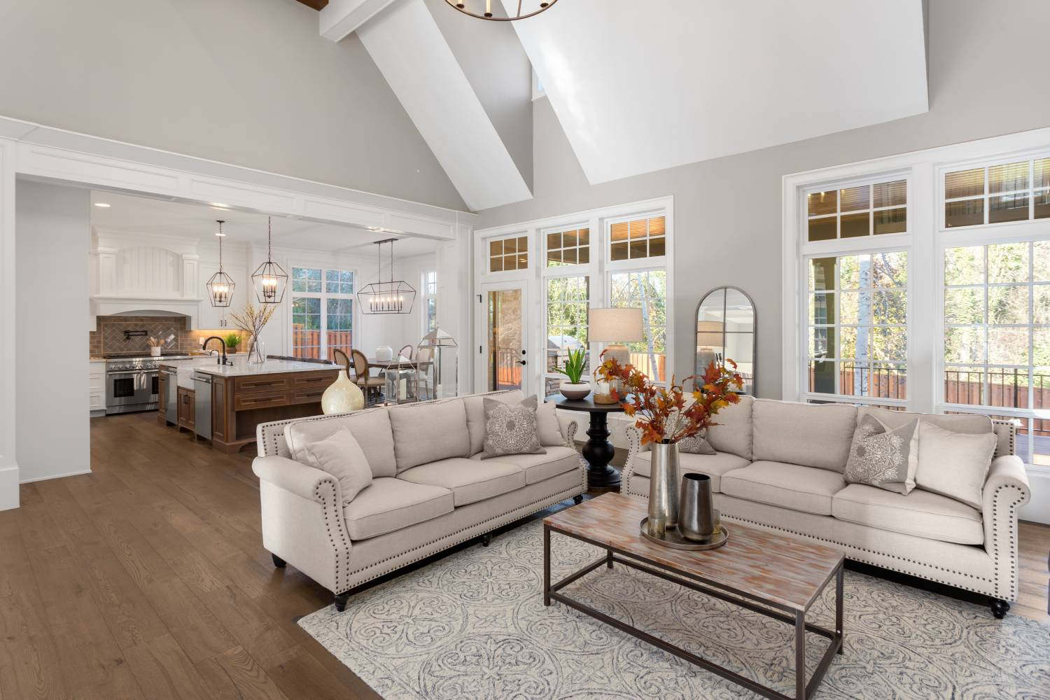
Open floor plans can make a home feel brighter, larger, and more connected—but they also create one of the trickiest paint-color problems in interior design.
In a traditional home, every room has walls and doorways that naturally separate one color from another. You can paint the dining room navy, the living room beige, and the kitchen white without worrying too much about how all three colors meet.
An open floor plan is different.
The kitchen may flow directly into the dining area. The dining room may share walls with the living room. A hallway may be visible from all three spaces. You may even be able to see the staircase, foyer, kitchen cabinets, flooring, countertops, and furniture from one standing position.
Suddenly, every paint decision affects everything else.
That’s why the best paint colors for an open floor plan are usually colors that can handle changing light, multiple materials, and several decorating zones without looking dramatically different from one wall to another.
That doesn’t mean everything needs to be beige.
In fact, one of the biggest mistakes people make is assuming an open-concept house needs one neutral paint color everywhere.
A successful open floor plan can include warm white, greige, beige, muted green, deeper accent colors, wood, and even dramatic cabinetry.
The secret is creating visual continuity without complete uniformity.
In this guide, we’ll explore some of the best paint colors for open floor plans from Sherwin-Williams, Benjamin Moore, and Behr, along with strategies for coordinating kitchens, living rooms, dining areas, hallways, trim, flooring, and accent colors.
Best Open Floor Plan Paint Colors at a Glance
| Paint Color | Brand | LRV | Overall Character | Best Use |
|---|---|---|---|---|
| Agreeable Gray SW 7029 | Sherwin-Williams | 60.39 | Warm greige | Best all-around neutral |
| Pale Oak OC-20 | Benjamin Moore | 68.64 | Light warm gray | Bright open layouts |
| Edgecomb Gray HC-173 | Benjamin Moore | 63.09 | Warm neutral greige | Elegant whole-house color |
| Accessible Beige SW 7036 | Sherwin-Williams | 57.67 | Warm beige-gray | Warm wood and earthy homes |
| Shoji White SW 7042 | Sherwin-Williams | 74.35 | Warm off-white | Light organic interiors |
| Alabaster SW 7008 | Sherwin-Williams | 82.22 | Soft warm white | Bright open spaces |
| White Dove OC-17 | Benjamin Moore | 83.16 | Classic soft white | Flexible neutral backdrop |
| Natural Linen SW 9109 | Sherwin-Williams | 66.33 | Warm linen beige | Cozy open layouts |
| Dolphin Fin 790C-3 | Behr | 59 | Light warm gray | Contemporary interiors |
| Repose Gray SW 7015 | Sherwin-Williams | 58.22 | Soft neutral gray | Gray-leaning open plans |
LRV, or Light Reflectance Value, measures how much light a color reflects on a scale of 0 to 100. While LRV doesn’t tell you exactly how a paint will look in your home, it is particularly useful when comparing colors for large connected spaces.
Let’s look at each option in more detail.
1. Sherwin-Williams Agreeable Gray SW 7029
If there is one color that belongs on almost every open-floor-plan shortlist, it is Sherwin-Williams Agreeable Gray SW 7029.
Despite the name, Agreeable Gray doesn’t behave like a traditional cool gray.
It sits closer to greige territory, combining gray with enough warmth to make it comfortable beside wood, cream, beige, black, and many other common interior finishes.
Sherwin-Williams currently lists Agreeable Gray with an LRV of 60.386, placing it in a useful middle-light range.
That depth is one reason it works so well across large open spaces.
It is light enough that it doesn’t generally overwhelm a living room, but it has enough body to create noticeable contrast against white trim.
Why Agreeable Gray works in open layouts
Open floor plans contain changing light.
One wall may receive direct afternoon sunlight while another wall around the corner receives almost none.
Extremely cool grays can become noticeably blue in shaded areas.
Very warm beige can become overly golden in bright light.
Agreeable Gray tends to sit closer to the middle.
That doesn’t mean it never changes—it does—but it is flexible enough to transition across many connected areas.
Best combinations
Agreeable Gray works particularly well with:
- White kitchen cabinets
- White oak floors
- Medium oak
- Walnut
- Black hardware
- Warm brass
- Cream upholstery
- Charcoal accents
- Muted sage green
Use it across living, dining, hallway, and kitchen-wall areas, then introduce stronger color through cabinetry, an island, furniture, or one carefully chosen accent room.
Best for: Homeowners who want a dependable greige throughout a large open layout.
2. Benjamin Moore Pale Oak OC-20
If you want your open floor plan to feel lighter than a typical greige, Benjamin Moore Pale Oak OC-20 is a beautiful option.
Benjamin Moore describes Pale Oak as a versatile neutral with warm gray undertones inspired by white oak. It has an LRV of 68.64.
That relatively high LRV makes Pale Oak especially useful in open spaces where maintaining brightness is important.
What Pale Oak looks like
Pale Oak sits between:
- Warm gray
- Greige
- Soft taupe
- Off-white
It has considerably more color than true white but remains soft enough to use across large wall areas.
This can be particularly helpful in a home with white kitchen cabinetry.
If both the cabinets and walls are bright white, an open kitchen-living space can sometimes feel flat.
Pale Oak creates subtle separation.
Works beautifully with
- White cabinets
- White oak floors
- Marble
- Warm quartz
- Walnut
- Black accents
- Cream fabrics
- Muted green
Benjamin Moore officially lists Chantilly Lace and Gray Cardigan in one expert-picked Pale Oak combination, while another pairing uses deeper Dinner Party and Wrought Iron, demonstrating how easily Pale Oak can move between light and dark accent palettes.
Best for: Bright, elegant open layouts where you want more warmth than white but less depth than medium greige.
3. Benjamin Moore Edgecomb Gray HC-173
Edgecomb Gray HC-173 is another excellent open-plan neutral.
Benjamin Moore describes it as a warm, welcoming go-to neutral and gives it an LRV of 63.09.
Despite its name, Edgecomb Gray often feels warmer than many conventional grays.
It lives in the comfortable territory between greige and beige.
Why Edgecomb Gray is good for connected spaces
The biggest advantage is restraint.
It provides color without demanding attention.
That is exactly what you need when your walls are already competing visually with:
Kitchen cabinets.
Countertops.
Backsplash.
Flooring.
Dining furniture.
Sofas.
Artwork.
Lighting.
An open floor plan doesn’t always need another star.
Sometimes the wall color needs to quietly connect everything.
Edgecomb Gray does that beautifully.
Pair Edgecomb Gray with
- Warm white trim
- White oak
- Dark walnut
- Cream sofas
- Black fixtures
- Brass lighting
- Muted blue
- Gray-green
- Taupe
Benjamin Moore’s official coordinating combinations include Boothbay Gray with White Heron and Pashmina with Dove Wing, showing how the color can work with both cool-muted accents and warmer neutrals.
Best for: A sophisticated open floor plan that needs a warm but subtle neutral foundation.
4. Sherwin-Williams Accessible Beige SW 7036
If your open floor plan contains a lot of wood or warm existing finishes, Accessible Beige SW 7036 deserves serious attention.
Sherwin-Williams lists Accessible Beige as a neutral with an LRV of 57.67. Its current color data gives it RGB values of 209, 199, and 184.
Accessible Beige is warmer than Agreeable Gray.
It has a more obvious beige-earthy quality while still being muted enough to avoid the heavily yellow appearance associated with older beige interiors.
Why Accessible Beige works with open plans
Many open layouts have one major fixed surface tying everything together:
Wood flooring.
If that flooring is honey oak, medium oak, warm brown, or similar, an icy gray wall color can make the wood appear unexpectedly orange.
Accessible Beige is much more comfortable beside warm wood.
It can connect a living room containing brown or cream upholstery with a kitchen containing oak cabinets or warmer counters.
Best pairings
Try Accessible Beige with:
- Honey oak
- White oak
- Walnut
- Cream
- Warm white
- Black
- Muted olive
- Sage
- Brown leather
- Brass
Sherwin-Williams’ current page also places Accessible Beige with coordinating colors Aesthetic White, Sanderling, and Cadet, giving you useful directions for light neutrals, deeper earthy tones, and muted blue accents.
Best for: Warm open-concept homes with oak, beige stone, brown, cream, or other earthy finishes.
5. Sherwin-Williams Shoji White SW 7042
Sometimes even greige feels like too much color.
If you want your open floor plan to feel light and warm without using a stark white, consider Shoji White SW 7042.
Sherwin-Williams currently lists Shoji White with an LRV of 74.345, significantly lighter than Agreeable Gray, Accessible Beige, or Repose Gray.
Shoji White sits between warm white and very light greige.
It contains enough pigment to keep a large room from feeling sterile but remains bright enough for hallways and connected spaces.
Why Shoji White works so well in open layouts
Open floor plans often have many materials.
Imagine:
Natural oak floors.
Cream sofa.
Black window frames.
White quartz.
Brass lighting.
Walnut furniture.
A completely crisp white can make those materials feel more separated.
Shoji White provides a softer background.
Coordinating colors
Sherwin-Williams currently pairs Shoji White with:
- Pure White SW 7005
- Fawn Brindle SW 7640
- Perle Noir SW 9154
That gives you a ready-made progression from light to medium to dark.
For example:
Walls: Shoji White
Trim: Pure White
Kitchen island: Fawn Brindle
Doors: Perle Noir
Add natural oak and you’ve already built most of an open-concept palette.
Best for: Organic-modern, transitional, Mediterranean-inspired, and warm minimalist interiors.
6. Sherwin-Williams Alabaster SW 7008
For homeowners who want to keep the walls white, Alabaster SW 7008 is one of the strongest options.
Sherwin-Williams lists Alabaster at an LRV of 82.215, meaning it reflects considerably more light than the greiges and beiges on this list.
But Alabaster is not a harsh white.
It has enough warmth and softness to feel comfortable across large areas.
Why Alabaster works in open floor plans
White can be very useful when the architecture itself is complex.
If you have:
- Large windows
- Multiple ceiling heights
- Kitchen cabinetry
- Built-ins
- Wood beams
- Stone fireplaces
- Several furniture zones
you may not need another strong wall color.
Alabaster lets those materials take center stage.
Best combinations
Pair Alabaster with:
- White oak
- Walnut
- Warm stone
- Black
- Olive
- Navy
- Beige
- Mushroom
- Brass
You can also paint walls, trim, and ceilings Alabaster while varying the sheen.
That removes visual interruptions and can make an open floor plan feel particularly cohesive.
Best for: Light-filled open layouts where architecture, furniture, and natural materials provide most of the color.
7. Benjamin Moore White Dove OC-17
Another excellent white for an open floor plan is Benjamin Moore White Dove OC-17.
Benjamin Moore calls White Dove a clean, classic white and gives it an LRV of 83.16.
Like Alabaster, White Dove gives you brightness without the severe quality of some very crisp whites.
Why White Dove is especially flexible
An open-concept home often includes several kinds of white.
You might have:
- White porcelain
- White quartz
- White cabinets
- White trim
- White lampshades
Trying to coordinate all those surfaces can become exhausting.
A soft wall white can often integrate more naturally than an extremely blue-white paint.
White Dove also works nicely when you want different rooms to contain stronger accent colors.
Benjamin Moore officially pairs it with Balboa Mist and Kendall Charcoal in one combination and with Revere Pewter and Country Redwood in another.
That versatility makes it useful as the quiet connecting color throughout an open house.
Best for: A classic warm-white backdrop that works across traditional, transitional, and contemporary open interiors.
8. Sherwin-Williams Natural Linen SW 9109
If your idea of a perfect open floor plan is warm, cozy, and organic rather than gray, consider Natural Linen SW 9109.
Sherwin-Williams lists Natural Linen with an LRV of 66.329 and classifies it within its yellow family, though visually it functions much more like a soft linen-inspired warm neutral than an obvious yellow.
Its higher LRV keeps it lighter than many conventional beige colors.
Why Natural Linen works
Open floor plans can sometimes feel visually cold because there are fewer walls and boundaries.
A warm wall color helps counteract that.
Natural Linen works particularly well with:
- Medium oak
- White oak
- Cream upholstery
- Brown leather
- Linen
- Woven rugs
- Brass
- Terracotta
- Olive
This makes it ideal for homes inspired by:
Organic modern.
California casual.
Modern Mediterranean.
Traditional warm neutral design.
One caution
If your kitchen contains extremely cool gray flooring, blue-white cabinets, and icy marble, Natural Linen may feel too warm.
It is best in a house that already embraces warmer materials.
Best for: Open floor plans that need warmth and softness rather than a gray-based neutral.
9. Behr Dolphin Fin 790C-3
For a slightly cleaner gray direction, consider Behr Dolphin Fin 790C-3.
Behr describes Dolphin Fin as a light warm gray and lists an LRV of 59.
That places it near Agreeable Gray and Repose Gray in overall depth.
Why Dolphin Fin works in open spaces
It gives you a gray appearance without automatically making the room feel icy.
This is useful if your open plan contains:
- White kitchen cabinets
- Gray or white stone
- Black hardware
- Light oak
- Neutral upholstery
Dolphin Fin is especially effective when you want the walls to feel more contemporary than beige but aren’t ready for a distinctly cool gray.
Pair it with
- White
- Light oak
- Walnut
- Black
- Charcoal
- Muted green
- Soft beige
- Natural linen
Best for: Contemporary open floor plans where gray still fits the permanent finishes.
10. Sherwin-Williams Repose Gray SW 7015
Repose Gray SW 7015 is another useful option when your palette leans gray rather than beige.
Sherwin-Williams currently lists Repose Gray with an LRV of 58.22.
It has enough depth to define large walls without becoming a dark paint color.
Repose Gray vs Agreeable Gray
If you are choosing between the two for an open floor plan, think of them this way:
Agreeable Gray: generally warmer and more greige.
Repose Gray: generally reads more clearly as gray.
Choose Repose Gray if your home contains:
- Cooler stone
- White cabinetry
- Black accents
- Gray flooring
- Contemporary finishes
Choose Agreeable Gray if your home contains more:
- Beige
- Warm wood
- Cream
- Brown
- Warm upholstery
Sherwin-Williams currently coordinates Repose Gray with Eider White, Pavestone, and Coral Clay, illustrating how the shade can bridge light neutrals, earthy taupes, and warmer accents.
Best for: Open interiors that need a soft neutral gray rather than a beige-heavy greige.
What Is the Best Overall Color for an Open Floor Plan?
If you want one answer that will work in the greatest number of situations, start by sampling:
Agreeable Gray SW 7029
Pale Oak OC-20
Edgecomb Gray HC-173
These three sit in a particularly useful range.
They are neither extremely dark nor almost white.
They also provide enough neutrality to coordinate with multiple rooms.
But your flooring should ultimately help decide.
For warm oak or brown flooring
Try:
- Accessible Beige
- Edgecomb Gray
- Natural Linen
- Shoji White
For pale white oak
Try:
- Pale Oak
- Shoji White
- Agreeable Gray
- Alabaster
For cooler gray flooring
Try:
- Repose Gray
- Dolphin Fin
- White Dove
Should an Entire Open Floor Plan Be One Color?
Not necessarily.
Using one color everywhere is the easiest approach, but it is not the only good approach.
A more sophisticated strategy is:
Use one dominant neutral
This color covers roughly 60–80 percent of the connected walls.
Add one secondary color
Use this in a clearly defined architectural area such as:
- Dining room
- Kitchen island
- Fireplace wall
- Built-ins
- Office opening
Add one dark anchor
This may appear through:
- Interior doors
- Cabinetry
- Island
- Fireplace
- Furniture
For example:
Main walls: Pale Oak
Dining area: muted sage
Kitchen island: charcoal
Trim: warm white
Flooring: natural oak
Now the rooms feel different without becoming disconnected.
Where Should Paint Colors Change in an Open Floor Plan?
Never change colors randomly in the middle of a flat wall.
The transition should occur at a natural architectural break.
Good transition points include:
- Inside corners
- Columns
- Beams
- Archways
- Cabinet boundaries
- Changes in ceiling height
- Hallway entrances
If you can see a hard paint line from the middle of the room, the transition will usually look accidental.
Architecture should tell you where one color stops and another begins.
How Many Colors Should You Use?
For most open floor plans, a simple palette works best.
Think in terms of:
1 main neutral
1 trim color
1–2 accent colors
1 dark grounding color
You can then repeat those colors in different proportions.
For example:
Main neutral
Shoji White
Trim
Pure White
Accent green
Muted sage
Dark accent
Iron Ore-style charcoal
Wood
White oak
This gives the entire home a recognizable visual language.
Should the Kitchen and Living Room Be the Same Color?
Often yes, especially when there is no clear architectural boundary.
But they don’t have to feel identical.
You can create separation through materials.
For example:
Kitchen
Shoji White walls
White cabinets
Walnut island
Stone countertops
Living room
Shoji White walls
Cream sofa
Walnut coffee table
Olive chairs
The paint stays the same, but the room still has its own personality.
This is often more successful than forcing a new wall color into every zone.
What About the Dining Room?
Dining areas are one of the best places to introduce a slightly stronger color.
Because a dining zone usually contains a table, chandelier, or architectural feature that already defines it, deeper paint can make sense.
Try:
- Sage green
- Olive
- Blue-gray
- Navy
- Mushroom
- Deep taupe
If you don’t have a clear wall boundary, however, use the main wall neutral and introduce color through furniture, curtains, or artwork instead.
Best White Trim for an Open Floor Plan
Consistency matters here.
Avoid using three different trim whites throughout connected rooms unless you have a very specific reason.
A single trim color creates continuity.
If your main wall color is warm, choose a trim white that doesn’t clash with it.
For example:
Shoji White walls + Pure White trim
works naturally because Sherwin-Williams itself lists Pure White as a coordinating color for Shoji White.
With Benjamin Moore Pale Oak, a cleaner white such as Chantilly Lace is one of the brand’s official coordinating directions.
For a softer look, you can also use the same white on walls and trim while changing sheen.
Should the Ceiling Be the Same Color?
You have three main options.
White ceiling
This is the safest and most traditional approach.
It creates clear definition.
Same white as the trim
This improves continuity and avoids mismatched whites.
Same color as the walls
This can be beautiful with lighter colors such as:
- Alabaster
- White Dove
- Shoji White
It creates a seamless, enveloping appearance and can make unusual ceiling lines less visually distracting.
How Natural Light Affects Open Floor Plans
Lighting is especially complicated in open layouts because one color may experience several different exposures.
Your kitchen may face east.
The living room may face south.
A connected hallway may receive almost no natural light.
That means your chosen neutral has to survive all three conditions.
This is why adaptable neutrals are usually safer than highly specific undertones.
South-facing areas
Colors tend to appear warmer.
North-facing areas
Paint often looks cooler or grayer.
East-facing areas
Warmest in the morning.
West-facing areas
Warmest in the afternoon.
Before committing to one color throughout an open floor plan, put samples in every major lighting zone.
Why LRV Matters More in Open Spaces
Open floor plans usually contain more wall area.
A color with an LRV around 58 can feel perfectly light in a sunny living room but considerably deeper down a connected hallway.
This is why comparing LRV is useful.
For reference:
Accessible Beige: 57.67
Repose Gray: 58.22
Dolphin Fin: 59
Agreeable Gray: 60.39
Edgecomb Gray: 63.09
Natural Linen: 66.33
Pale Oak: 68.64
Shoji White: 74.35
Alabaster: 82.22
White Dove: 83.16
The higher-LRV colors generally create lighter backgrounds.
The lower ones give you more wall definition.
Neither is inherently better.
Best Paint Colors With Open-Plan White Oak Floors
White oak is extremely versatile.
Good wall colors include:
- Shoji White
- Pale Oak
- Alabaster
- White Dove
- Agreeable Gray
- Edgecomb Gray
For organic-modern interiors, Shoji White and Pale Oak are especially strong starting points.
Add black, walnut, olive, linen, and brass for contrast.
Best Paint Colors With Honey Oak Floors
Honey oak requires more care because of its strong golden-orange warmth.
Start with:
- Accessible Beige
- Edgecomb Gray
- Natural Linen
- Soft warm white
Avoid assuming a cool gray will “neutralize” the oak.
Sometimes the contrast simply makes the floor look even more orange.
Warm muted neutrals are often more successful.
Best Paint Colors With White Kitchen Cabinets
White cabinetry gives you flexibility.
Try:
Pale Oak for soft contrast.
Agreeable Gray for classic greige.
Edgecomb Gray for warmth.
Repose Gray for a more contemporary gray.
Shoji White for a subtle layered-white effect.
If your cabinet white is extremely cool, compare it directly with any warm neutral before painting.
Best Paint Colors With Wood Kitchen Cabinets
For natural oak:
- Accessible Beige
- Shoji White
- Edgecomb Gray
- Natural Linen
For walnut:
- Pale Oak
- Shoji White
- Alabaster
- Agreeable Gray
For dark espresso:
- White Dove
- Alabaster
- Pale Oak
- Shoji White
The greater the contrast between the wall and cabinetry, the more architectural definition you’ll create.
Best Open Floor Plan Palette Ideas
Palette 1: Warm Organic
Walls: Shoji White
Trim: Pure White
Cabinetry: Warm white
Island: Walnut
Accent: Sage green
Floor: White oak
Metal: Brass or black
This is ideal for organic-modern interiors.
Palette 2: Classic Greige
Walls: Agreeable Gray
Trim: Soft white
Kitchen cabinets: White
Island: Charcoal
Wood: Medium oak
Accent: Muted navy
This works across transitional and modern farmhouse homes.
Palette 3: Light and Airy
Walls: Pale Oak
Trim: Clean white
Cabinets: White
Wood: Pale oak
Accent: Wrought-iron black
Textiles: Cream and oatmeal
A strong option for smaller open layouts.
Palette 4: Warm Earthy
Walls: Accessible Beige
Trim: Warm white
Cabinetry: Cream
Wood: Oak or walnut
Accent: Olive
Furniture: Brown leather and cream
Excellent if your permanent finishes lean warm.
Palette 5: Contemporary Gray
Walls: Repose Gray
Trim: White
Cabinetry: White
Island: Black or charcoal
Wood: Light oak
Metal: Matte black
Best for homes with cooler stone or gray finishes.
Common Open Floor Plan Paint Mistakes
Using too many wall colors
Every zone does not need its own paint color.
Furniture, lighting, rugs, and cabinetry can create separation.
Ignoring flooring
Flooring often covers more visible surface area than anything except the walls.
Choose paint with it, not separately.
Mixing incompatible whites
White cabinets, white trim, white walls, and white countertops can each have different undertones.
Compare them together.
Choosing paint from one wall
A color may look perfect beside a sunny window and awful in the connected hallway.
Sample every exposure.
Creating random paint transitions
Use architectural breaks.
Never simply stop one color halfway across an uninterrupted wall.
How to Test Paint for an Open Floor Plan
This is one situation where tiny paint chips really aren’t enough.
Make large samples.
Then move them around.
Put each candidate beside:
- Flooring
- Kitchen cabinets
- Countertops
- Backsplash
- Sofa
- Dining furniture
- Fireplace
- Trim
Observe the samples:
- Morning
- Midday
- Late afternoon
- Evening
- Under artificial lighting
Sherwin-Williams and Benjamin Moore both warn that colors shown on digital screens may differ from actual paint, making physical samples especially important.
A color that needs to cover several connected rooms deserves more testing than a color used in one small bedroom.
What Is the Safest Open Floor Plan Color?
If you’re overwhelmed, narrow your first sample order to four colors:
Agreeable Gray SW 7029
For balanced warm greige.
Pale Oak OC-20
For a lighter sophisticated neutral.
Shoji White SW 7042
For a warm, airy off-white.
Accessible Beige SW 7036
For warmer earthy interiors.
Those four cover most of the major neutral directions.
Once you see them beside your flooring and cabinetry, you’ll quickly discover whether your home wants something:
Warmer.
Cooler.
Lighter.
Or deeper.
Final Thoughts
The best paint color for an open floor plan isn’t necessarily the most popular neutral.
It’s the color that can successfully connect everything you can see at once.
The kitchen.
The living room.
The dining area.
The hallway.
The flooring.
The cabinetry.
The countertops.
The furniture.
The trim.
And the changing natural light.
For a dependable greige, Agreeable Gray SW 7029 remains an excellent starting point, with an LRV of about 60.39.
For a lighter, elegant neutral, Pale Oak OC-20 offers warm gray undertones and an LRV of 68.64.
For an open home filled with warm wood and earthy finishes, Accessible Beige SW 7036 provides more warmth and depth at an LRV of 57.67.
For an airy organic interior, Shoji White SW 7042 gives you the brightness of an off-white with enough warmth and pigment to keep large rooms from feeling sterile.
And if you want white walls, Alabaster SW 7008 and Benjamin Moore White Dove OC-17 are both excellent softer alternatives to stark white, with LRVs above 82.
Most importantly, remember that an open floor plan doesn’t need to be painted one color from end to end.
The goal is flow, not sameness.
Use one dominant neutral to visually connect the main spaces.
Repeat one trim color throughout.
Then introduce personality through a kitchen island, built-ins, dining area, cabinetry, doors, furniture, rugs, artwork, and smaller accent areas.
That approach gives you enough consistency to make the home feel intentional without turning the entire space into one uninterrupted neutral box.
And when you’re deciding between two almost-identical shades, don’t ask which one looks prettier on the paint card.
Ask which one makes your floors, cabinets, countertops, furniture, and neighboring rooms look better together.
That’s usually the color that belongs on the wall.