Choosing the perfect neutral paint color sounds easy until you actually stand in front of a wall filled with beige and gray paint chips.
Suddenly, one beige looks too yellow. Another feels dated. A beautiful gray on the sample card turns icy blue on your wall. And the supposedly “perfect neutral” you saved from Pinterest somehow looks completely different inside your own home.
This is exactly why greige paint colors have become such a dependable choice.
Greige sits somewhere between gray and beige, combining the sophistication of gray with the warmth and comfort of beige. Instead of feeling cold and industrial or overly creamy and traditional, a good greige creates a soft neutral backdrop that works with an enormous range of decorating styles.
Behr offers some particularly attractive greige and warm gray paint colors, ranging from barely-there neutrals to deeper taupe-gray shades.
Some lean noticeably beige. Others sit closer to gray. A few have subtle green, brown, or taupe undertones that become more visible as the light changes throughout the day.
That variation is important because there is no single “best greige” for every home.
The right choice depends on your natural light, flooring, countertops, cabinetry, furniture, and even the direction your windows face.
In this guide, we’ll explore 10 of the best Behr greige paint colors for creating a warm, neutral home, along with their undertones, ideal rooms, coordinating materials, and the situations where each color works best.
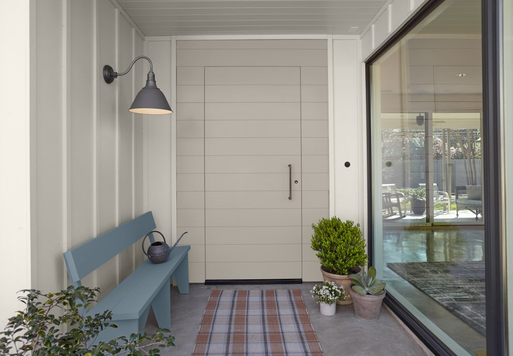
Quick Comparison of the Best Behr Greige Paint Colors
| Behr Paint Color | Overall Look | Best For |
|---|---|---|
| Sculptor Clay PPU5-08 | Soft classic greige | Whole-house walls |
| Greige PPU24-11 | Balanced medium greige | Living and dining rooms |
| Wheat Bread 720C-3 | Warm taupe-beige greige | Cozy interiors |
| Dolphin Fin 790C-3 | Light warm gray | Open-plan spaces |
| Dove HDC-MD-21 | Airy light greige | Dark floors and smaller rooms |
| Toasty Gray N320-2 | Warm taupe-gray | Bedrooms and living rooms |
| Campfire Ash N320-1 | Light balanced gray | Modern neutral interiors |
| Creamy Mushroom PPU5-13 | Earthy mushroom greige | Warm organic homes |
| Silver Drop 790C-2 | Very light gray-greige | Bright, minimal interiors |
| Ashen Tan N220-2 | Warm gray-tan | Cozy traditional spaces |
One thing to remember before comparing these colors is that “greige” is more of a design category than a strict scientific classification. Several of these colors may officially belong to Behr’s gray, neutral, white, or other color families, but they can function beautifully as greiges when used in real interiors.
Let’s look at them individually.
1. Behr Sculptor Clay PPU5-08
If you want a classic greige that doesn’t feel aggressively gray or obviously beige, Behr Sculptor Clay PPU5-08 is an excellent place to start.
Behr itself describes Sculptor Clay as a light greige, inspired by the natural appearance of clay on a potter’s wheel.
That description captures the personality of the color surprisingly well.
Sculptor Clay has an earthy softness that prevents it from looking sterile. Rather than giving you the crisp, cool feeling associated with many modern grays, it creates a comfortable neutral background.
This makes it particularly useful when painting large areas of a home.
A strong paint color may look wonderful on one accent wall but become exhausting when carried through a living room, hallway, stairwell, and kitchen. Sculptor Clay is quiet enough to work across connected spaces while still providing more depth than plain white.
Where Sculptor Clay works best
Sculptor Clay is particularly attractive in living rooms, dining rooms, bedrooms, hallways, entryways, open-plan spaces, and family rooms.
It works beautifully with natural oak, medium brown wood, off-white upholstery, linen, woven baskets, black accents, stone, brass, and muted earth tones.
If your decorating style falls somewhere between transitional, modern farmhouse, organic modern, contemporary, or traditional, Sculptor Clay is incredibly adaptable.
It can also be a good solution for homeowners who currently have beige walls but want something fresher.
Instead of making the dramatic jump from warm beige to cold gray, Sculptor Clay gives you that modern gray influence while retaining enough warmth to feel welcoming.
Best overall greige: If you’re overwhelmed by choices, Sculptor Clay deserves a spot among your first samples.
2. Behr Greige PPU24-11
Sometimes paint companies make things easy.
Behr Greige PPU24-11 is exactly what the name suggests: a carefully balanced combination of gray and beige.
Behr describes it as a medium gray subtly warmed by sandy beige, and its official Light Reflectance Value is 46.
An LRV in this range means Greige has noticeable body.
It isn’t an extremely light neutral that disappears against white trim. Instead, it has enough depth to create a visible contrast while still remaining versatile.
That’s especially useful in rooms where you want the walls to feel intentionally colored without making them the main decorative statement.
What does Behr Greige look like?
Expect a grounded, soft gray-beige.
The beige influence keeps it from feeling icy, while the gray prevents it from becoming overly creamy or yellow.
In warmer natural light, the beige side may become more apparent.
Under cooler illumination, the color can settle further into its gray character.
This ability to shift is part of what makes greige so interesting, but it’s also why sampling is essential.
Where Behr Greige works best
Try Greige PPU24-11 in living rooms, dining rooms, bedrooms, offices, entryways, and open-plan family spaces.
It can look particularly sophisticated beside warm white trim, dark wood furniture, black metal, natural textiles, medium oak, and muted green accessories.
Because it has more depth than many pale greiges, it can also make a large room feel warmer and more grounded.
Best true medium greige: Choose Behr Greige if you want an unmistakable balance of beige and gray rather than a color sitting strongly on one side.
3. Behr Wheat Bread 720C-3
If your idea of the perfect greige involves warmth, comfort, and earthy character, Wheat Bread 720C-3 should be high on your list.
Behr describes Wheat Bread as a rustic neutral that makes rooms feel comfortable and homey. Its LRV is 56, with Behr’s current color data showing a balanced warm neutral composition.
Behr has also recently highlighted Wheat Bread as a taupe-gray combining earthy beige, gray, and taupe characteristics.
That combination makes it warmer than many conventional greiges.
What does Wheat Bread look like?
Think of a soft taupe-beige with enough gray mixed in to keep it sophisticated.
It doesn’t have the chilly quality that some gray-dominant neutrals develop.
Instead, Wheat Bread feels comfortable and familiar.
That’s why it works so well with traditional wood tones and natural materials.
Imagine Wheat Bread walls beside oak flooring, exposed wood beams, creamy upholstery, brass lighting, beige stone, woven rugs, and warm white cabinetry.
The entire room starts to feel cozy without becoming dark.
Best rooms for Wheat Bread
This color is excellent for kitchens, family rooms, living rooms, dining rooms, bedrooms, and even exteriors.
Behr has recently showcased Wheat Bread alongside natural wood cabinetry, warm materials, white accents, and deeper contrasting colors, demonstrating how easily it integrates into layered neutral palettes.
It’s an especially smart option if your house already contains beige tile, tan carpeting, granite, warm wood cabinetry, or brown furniture that might fight with colder gray paint.
Best warm greige: Wheat Bread is a wonderful choice when you want your neutral walls to feel cozy rather than crisp.
4. Behr Dolphin Fin 790C-3
Dolphin Fin 790C-3 is technically described by Behr as a light warm gray, but in many homes it plays the role of a beautiful gray-leaning greige.
Behr lists Dolphin Fin with an LRV of 59 and describes it as a versatile warm gray.
That combination makes it lighter and airier than several other colors on this list.
If a deeper greige makes your room feel heavy, Dolphin Fin may give you the balance you’re looking for.
Why Dolphin Fin is so versatile
Some warm neutrals are clearly beige.
Others are unmistakably gray.
Dolphin Fin sits closer to gray but has enough softness to avoid the cold, blue appearance that homeowners often fear when choosing gray paint.
That’s particularly helpful in open-plan interiors.
A neutral used across a kitchen, living room, hallway, and dining area needs to cooperate with several different materials at once.
Dolphin Fin can sit beside warm woods and creamy textiles without looking awkward while also working with cooler accents such as black, charcoal, muted blue, or white.
Best uses for Dolphin Fin
Consider it for living rooms, bedrooms, open-concept spaces, hallways, kitchens, and home offices.
It can also provide a subtle wall color behind white kitchen cabinets without creating a dramatic contrast.
For an airy modern look, combine Dolphin Fin with light oak, warm white, linen, pale stone, and black details.
For something more traditional, introduce walnut furniture, brass fixtures, leather, and warmer textiles.
Best gray-leaning greige: Dolphin Fin is ideal if you want your walls to read primarily gray while still feeling inviting.
5. Behr Dove HDC-MD-21
If you’re searching for a lighter greige that can brighten a room while preserving warmth, don’t overlook Dove HDC-MD-21.
Behr describes Dove specifically as a warm greige that appears as a soothing gray, and the official color information gives it an LRV of 66.
That relatively high LRV means Dove reflects considerably more light than deeper neutrals such as Behr Greige.
This can be particularly useful in rooms where you want a soft neutral appearance without sacrificing brightness.
Dove and dark wood floors
One especially useful recommendation comes directly from Behr’s color team.
Behr notes that Dove works particularly well in rooms containing dark wood flooring because its beige-gray balance can soften deep stains such as walnut and espresso while maintaining an open, comfortable atmosphere.
That makes Dove an appealing solution for older homes with dark hardwood.
Instead of fighting that flooring with an icy gray or doubling down on warmth with a yellow beige, Dove creates a gentle bridge between the two.
Where Dove works best
Use it in smaller living rooms, bedrooms, offices, entryways, hallways, bathrooms, and spaces with dark flooring.
Because it is fairly light, it is also useful for whole-house applications.
Pair it with creamy white or clean neutral trim, warm wood furniture, stone, muted greens, black details, or soft beige fabrics.
Best light greige: Dove is an excellent candidate when you want warmth but need your home to remain bright and spacious.
6. Behr Toasty Gray N320-2
The name Toasty Gray N320-2 tells you almost everything you need to know.
This isn’t a chilly architectural gray.
Behr describes Toasty Gray as a calm and elegant taupe-gray inspired by the warmth of a winter hearth.
That taupe influence pushes Toasty Gray firmly into warm-neutral territory.
Depending on the light and surrounding finishes, you may see gray, beige, taupe, or even a hint of brown.
Why Toasty Gray works in cozy interiors
Toasty Gray has enough warmth to pair comfortably with materials that often create trouble for cooler paint colors.
Think tan tile, warm wood flooring, beige upholstery, brown leather, cream curtains, brass hardware, and natural stone.
Instead of making those materials look unusually yellow or orange, Toasty Gray tends to belong in the same visual family.
That makes it especially useful when you’re updating an existing home rather than designing a room completely from scratch.
You may not be replacing the floor, fireplace stone, countertops, and sofa.
Choosing a neutral that works with those permanent finishes can make a much bigger difference than simply selecting the trendiest paint color.
Best rooms for Toasty Gray
It’s a strong option for bedrooms, family rooms, living rooms, dining rooms, offices, and entryways.
It also looks beautiful with layered warm neutrals: ivory, oatmeal, camel, mushroom, chocolate brown, and muted olive.
Best taupe-leaning greige: Toasty Gray is perfect for homeowners who want gray sophistication without losing warmth.
7. Behr Campfire Ash N320-1
For something lighter and more restrained, consider Campfire Ash N320-1.
Behr describes Campfire Ash as a soft dusty gray balanced between warm and cool.
That balance is precisely what makes it useful.
Campfire Ash isn’t necessarily the warmest paint on this list, but it can work as a subtle greige in the right environment because it doesn’t lean aggressively cool.
When Campfire Ash makes sense
Imagine you like the idea of greige but don’t want your walls to look beige.
Campfire Ash can be a nice compromise.
Its gray side keeps the appearance modern and clean, while its softer character allows it to live more comfortably beside wood and warm decorative materials than many blue-based grays.
It’s particularly attractive in spaces where you want the furniture and artwork to command attention.
Rather than becoming an obvious design feature, Campfire Ash quietly supports the rest of the room.
What to pair with Campfire Ash
Use natural oak, white or off-white trim, textured cream fabrics, charcoal accents, black metal, muted wood furniture, sage green, and natural stone.
Because it sits near the middle of the warm-cool spectrum, your existing lighting can strongly influence the final appearance.
Warm bulbs and southern sunlight may make the room feel softer.
Cool LEDs or northern light can emphasize the gray.
Best subtle neutral greige: Campfire Ash suits homeowners who want just a whisper of warmth rather than an obvious beige undertone.
8. Behr Creamy Mushroom PPU5-13
“Mushroom” colors have become increasingly popular because they offer something ordinary gray and beige often cannot: depth without harshness.
Creamy Mushroom PPU5-13 is a great example.
Behr describes Creamy Mushroom as calming, earthy, grounding, approachable, and soft enough to provide a backdrop for other decorative elements.
It’s warmer and earthier than many gray-forward greiges.
Instead of giving your room a crisp showroom quality, Creamy Mushroom creates a collected, comfortable atmosphere.
Why mushroom colors work so well
A mushroom neutral typically combines elements of beige, gray, taupe, and brown.
That complexity allows it to coordinate beautifully with natural materials.
Creamy Mushroom can look especially rich beside walnut, medium oak, travertine, limestone, terracotta, linen, wool, leather, and aged metals.
If your ideal interior includes organic shapes, textured fabrics, handmade pottery, warm wood, and soft lighting, this color fits naturally into the picture.
Behr currently shows Creamy Mushroom in living rooms, offices, bathrooms, entryways, and exterior applications, highlighting its broad versatility.
Where Creamy Mushroom works best
Use it in bedrooms, cozy living rooms, dining rooms, home offices, reading rooms, and spaces where you want warmth and quiet sophistication.
It can be especially effective in a bedroom with cream bedding, warm wood nightstands, linen curtains, and soft brass lighting.
Best earthy greige: Creamy Mushroom is an excellent option if you want your neutral palette to feel natural, warm, and sophisticated.
9. Behr Silver Drop 790C-2
Sometimes you want the softness of greige without seeing much actual beige.
That’s where Silver Drop 790C-2 becomes interesting.
Behr currently categorizes Silver Drop within its light color offerings, and it is considerably more subtle than the medium-depth greiges on this list.
It works best for homeowners looking for an almost-white gray with enough softness to prevent it from feeling clinical.
What does Silver Drop look like?
Silver Drop generally behaves like a delicate neutral gray.
However, its appearance is highly dependent on the room around it.
Warm wood, cream fabrics, and warmer artificial lighting can encourage its softer neutral character.
Cool light and blue-toned furnishings can make it appear more clearly gray.
That means Silver Drop is a particularly good candidate for sampling before committing.
But when it works, it can be beautiful.
It gives white trim just enough contrast to define architectural details while maintaining an airy, understated room.
Best uses for Silver Drop
Consider Silver Drop for small rooms, apartments, hallways, bedrooms, minimalist living rooms, kitchens with white cabinetry, or spaces where a darker greige might absorb too much light.
Pair it with pale oak, medium oak, white, charcoal, black, mushroom beige, muted greenery, linen, and light stone.
Best barely-there greige: Silver Drop is ideal if you want something sophisticated and soft without making the walls look noticeably beige.
10. Behr Ashen Tan N220-2
The final shade on our list, Ashen Tan N220-2, sits comfortably between warm gray and tan.
Behr describes Ashen Tan as a light gray neutral with a warm undertone designed to create a cozy atmosphere.
That makes it especially useful in homes where cold grays simply don’t work.
Why Ashen Tan can be easier than gray
Imagine a room containing honey oak floors, a beige sofa, brown furniture, cream curtains, and warm granite.
Drop a blue-gray paint color into the middle of that palette and suddenly everything can feel disconnected.
Ashen Tan takes the opposite approach.
Its warmer undertone helps it communicate with those existing materials.
You still get the toned-down, modern quality of gray, but the warmth keeps the room from feeling stark.
Best rooms for Ashen Tan
Ashen Tan can work beautifully in living rooms, bedrooms, entryways, hallways, family rooms, and traditional kitchens.
It is particularly attractive in homes with warm wood floors or slightly older finishes that you want to modernize without replacing.
Use warm white trim to keep the palette gentle, or pair it with a cleaner white for stronger definition.
Add olive green, dark brown, cream, muted rust, charcoal, or black accents for depth.
Best greige for warm existing finishes: Ashen Tan deserves consideration when your home contains lots of beige, brown, tan, or wood.
How to Choose Between These Behr Greige Colors
The biggest mistake people make when choosing greige paint is asking:
“Which greige is the prettiest?”
A better question is:
“Which greige looks best with the things already inside my room?”
Paint doesn’t exist in isolation.
Your flooring can make a greige look warmer. A granite countertop can reveal a hidden undertone. Bright white cabinets can suddenly make a subtle neutral appear darker. Even the greenery outside your windows can influence how you perceive the walls.
Start with your permanent finishes.
If your home contains warm oak, beige stone, tan carpeting, or brown furniture, look first at warmer options such as Wheat Bread, Toasty Gray, Creamy Mushroom, or Ashen Tan.
For a more balanced contemporary appearance, compare Sculptor Clay and Behr Greige.
If you want something lighter or more gray-forward, sample Dove, Dolphin Fin, Campfire Ash, or Silver Drop.
Understanding LRV Before Choosing Greige
You’ll often see a number called LRV when researching paint.
LRV stands for Light Reflectance Value.
Behr explains that the scale runs from 0 to 100, with lower values reflecting less light and higher values reflecting more.
This doesn’t tell you exactly how light or dark a paint will look in every room, but it gives you a useful comparison point.
For example, Behr Greige has an LRV of 46, while Wheat Bread is 56, Dolphin Fin is 59, and Dove is 66.
All other things being equal, Dove will generally feel lighter and more reflective than Behr Greige.
But natural light still matters enormously.
A mid-range color in a bright south-facing living room may appear lighter than a high-LRV color in a dim hallway.
Use LRV to compare colors, not to predict the finished room with absolute certainty.
What Undertones Can Greige Have?
Here’s where greige becomes tricky.
A paint color isn’t simply “gray plus beige.”
Many greiges also contain subtle secondary undertones.
You may encounter green-gray greiges, pink or violet taupes, yellow-beige neutrals, brown-gray mushroom shades, or cooler gray-dominant colors.
These undertones may be almost invisible on a tiny paint chip.
Put the same color beside your flooring, however, and suddenly they become obvious.
This is why a neutral that looked perfect online can look strangely green, purple, pink, or yellow once painted.
The paint hasn’t changed.
The surrounding colors are changing how your eyes perceive it.
What Greige Works Best With Wood Floors?
Greige and wood are natural partners, but the exact shade matters.
For dark walnut or espresso floors, lighter options such as Dove can create beautiful contrast. Behr specifically recommends Dove’s beige-gray balance for deeper wood stains.
For golden or honey oak, warmer shades such as Wheat Bread, Creamy Mushroom, Toasty Gray, or Ashen Tan are often safer starting points.
For pale modern oak, Sculptor Clay, Dolphin Fin, Campfire Ash, and Silver Drop can create a softer contemporary palette.
The trick is not necessarily to match the wood.
You simply want the undertones to coexist rather than compete.
What White Trim Goes With Greige?
White trim can make a greige look fantastic — or expose every undertone you didn’t notice before.
A warm greige beside a very cold blue-white may suddenly appear more beige or yellow.
A gray-leaning greige beside an extremely creamy white may appear cooler than expected.
For warm, earthy greiges, slightly softer whites often create the most natural transition.
For light gray-forward shades, a cleaner white can give the room a crisp, modern appearance.
The safest strategy is remarkably simple:
Sample your trim white and greige together.
Never choose one in isolation.
Paint large boards and place them beside each other, your flooring, countertops, and furniture.
Is Greige Still Popular?
Greige remains useful because it isn’t really dependent on one decorating trend.
Pure cool gray had a huge moment in interior design, but many homeowners eventually discovered that gray-on-gray interiors could feel sterile.
Traditional yellow-beige can create the opposite problem, sometimes making a room feel heavier or dated.
Greige occupies the comfortable space between the two.
And today’s warm-neutral interiors make that flexibility particularly valuable.
Modern rooms are increasingly layered with wood, linen, stone, clay, warm metals, textured fabrics, creams, mushroom tones, browns, muted greens, and earthy accents.
Greige provides an easy backdrop for all of them.
The key is choosing a nuanced greige rather than assuming every beige-gray color will work everywhere.
Which Behr Greige Is Best for a Whole House?
For a whole-house neutral, I’d start by sampling Sculptor Clay PPU5-08, Dove HDC-MD-21, Dolphin Fin 790C-3, and Wheat Bread 720C-3.
Sculptor Clay gives you the most recognizable light greige.
Dove is useful when brightness matters.
Dolphin Fin is an excellent choice for homeowners who prefer gray over beige.
Wheat Bread provides greater warmth and works particularly well with natural wood and earthy finishes.
Don’t automatically use the same shade in every room, however.
A whole-house palette can remain cohesive while using slightly different neutrals in areas with dramatically different lighting.
Final Thoughts
Finding the best Behr greige paint isn’t about locating a magical color that looks perfect in every photograph.
It’s about finding the right balance for your particular home.
If you want a classic, versatile greige, begin with Sculptor Clay PPU5-08.
For a balanced medium neutral, try Greige PPU24-11.
For warmth and coziness, look at Wheat Bread 720C-3, Toasty Gray N320-2, Creamy Mushroom PPU5-13, and Ashen Tan N220-2.
If you prefer something lighter and more gray-forward, compare Dolphin Fin 790C-3, Dove HDC-MD-21, Campfire Ash N320-1, and Silver Drop 790C-2.
Most importantly, don’t choose from a phone screen.
Paint colors change dramatically according to natural light, artificial lighting, surrounding finishes, and room orientation.
Buy samples of your top two or three choices and paint large sections or removable sample boards. Look at them in the morning, afternoon, and evening. Move the samples beside your flooring, sofa, kitchen cabinets, backsplash, and countertops.
You may discover that the greige you almost ignored is the one that suddenly pulls the entire room together.
And that’s ultimately what a great neutral should do.
It shouldn’t demand attention every time you walk into the room.
It should quietly connect everything around it — the wood, textiles, furniture, stone, lighting, and architecture — while making your home feel warmer, calmer, and more intentional.